Have you ever felt the difference in mood between a room painted in blues or purples versus one in yellows or oranges?
This contrast mirrors the mood and aesthetic of a sunny beach versus a snowy landscape.
This phenomenon, known in color theory as color temperature, divides colors into two categories – warm colors and cool colors. In this guide, well explore the characteristics, psychological effects, and design applications of warm and cool colors.
With a deep understanding of color temperature, you can create designs that are not only visually appealing but also highly effective and impactful.
You’ll learn how to:
- Communicate emotions effectively.
- Guide viewer attention in a composition.
- Create harmony or contrast in design.
- Influence how spaces feel in interior design or branding.
What is color temperature?
Color temperature refers to the perceived warmth or coolness of a color. This concept is rooted in both science and aesthetics.
Scientifically, it originates from the color spectrum visible in different lighting conditions. But aesthetically, it’s how we interpret colors in terms of emotional warmth (reds, oranges, yellows) or coolness (blues, greens, purples).
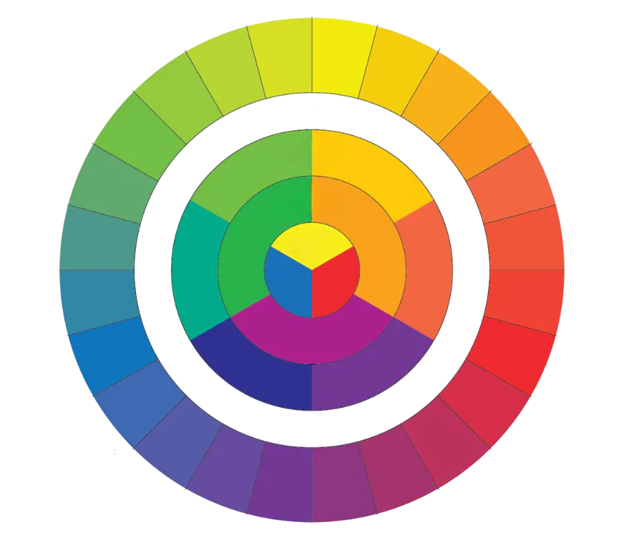
The placement of these hues on the color wheel reflects this divide, with warm colors dominating one half and cool colors the other.
Why color temperature matters
Color temperature plays an essential role in color psychology, the study of how colors influence mood, behavior, and perception. This connection makes it an invaluable tool for designers, marketers, and artists.
Let’s dive deeper into the two categories to understand their unique characteristics and applications.
Warm colors: Definition
Warm colors range from yellow, orange, and red, on the opposite side of the color wheel. They’re typically associated with fire, the sun, and heat.

The psychology of warm colors
Warm colors are highly evocative and are often linked to emotions like passion, energy, and comfort. Let’s explore the two primary emotions they evoke: energy and comfort.
Energy/excitement
Warm colors, particularly red and orange, are synonymous with energy and intensity. Think of the fiery glow of a sunset or the bright, inviting warmth of a bonfire – these colors stimulate the senses and energize the viewer.
Psychologically, warm colors can increase feelings of enthusiasm and urgency, which is why they are often used in designs intended to grab attention, such as call-to-action buttons, sale signs, restaurants or fast food branding. Red, for instance, is linked to excitement and passion, while orange conveys friendliness and approachability.
In design, using warm colors strategically can create a sense of vibrancy and dynamism, making them ideal for projects that need to stand out or create excitement, such as event posters, flyers, or coupons/promotions.
You can evoke different emotions from a single hue by adjusting its hue, saturation, and value (HSV).
Comfort/cozy feelings
Alternatively, warm colors can also evoke a sense of comfort and coziness.The golden glow of candlelight or the warm tones of autumn leaves create a feeling of security and nostalgia that is deeply connected to warm hues like yellow and soft orange. Additionally, the heat of a desert and the golden glow of the sun are often associated with the literal warmth of warm colors.
Incorporating warm colors in interiors, art, or graphic designs can make environments feel more inviting and homey. For instance, interior designers often use warm palettes to create cozy living rooms, while graphic designers might use warm tones to make branding feel approachable and welcoming.
Common uses of warm colors
Marketing and branding: To create enthusiasm and urgency. Variations of red are often used to symbolize urgency in calls to action. You may often see oranges where a friendly or inviting mood is trying to be achieved. Yellow is often used for pops of color to draw the eye, for cheerfulness, and as a symbol of summer.

Interior design: To make spaces feel intimate and cozy, especially in living rooms or restaurants.

Art and photography: Frequent feelings conveyed with warm colors in art and photography are coziness, vibrancy, excitement, and romance.

Cool colors: Definition
Cool colors (also known as cold colors) range between blue, green, and purple on one side of the color wheel. They’re often associated with nature, water, and the sky.

The psychology of cool colors
Cool colors are often associated with calm, serenity, reflectiveness, and sadness. We’ll explore the two primary emotions behind this color temperature: calm and sadness. One could argue these are two completely different emotions while one could also argue, they fit together harmoniously.
Calm/serenity
One of the most prominent emotions evoked by cool colors is a sense of calm. Think of a serene sky or the steady waters of a pristine lake – these images conjure a feeling of peace and serenity that is inherently linked to cool hues.
Psychologically, cool colors have been found to have a soothing effect on the mind, helping to reduce stress and anxiety levels. In design, incorporating cool colors can create spaces, images or products that feel tranquil, inviting, and conducive to relaxation. Think of environments where peace and serenity are desired, such as bedrooms, spas, and meditation spaces.
Melancholy/sadness
On the flip side, cool colors can also evoke feelings of sadness and melancholy. Remember, the character, Sadness, in the film Inside Out? The choice to depict Sadness as blue is no coincidence; it’s a very literal example of how blue can be well, sad. And its a great example of how that connection is accepted in popular culture and psychology.
In design, careful consideration must be given to the context and usage of a cold palette to avoid inadvertently eliciting negative emotional responses from viewers. But for the most part, it all comes down to context. It’d be difficult to inadvertently make an audience sad with a blue poster, for example.
Depending on the work you do, you may want to elicit these feelings in your audience. For example, a graphic designer partnering with a mental health organization may want to use the color blue on materials; not because they want to make the viewers sad, but because the color may resonate more strongly with the audience’s emotions.
Common uses of cool colors
Healthcare and wellness: To promote trust and calmness. For example, green is often used for eco-friendly brands.

Corporate design: To convey professionalism and stability. Youll often find blue is used frequently in the finance industry.

Interior design: To create open, airy spaces, or tranquil environments, cool colors are often used in healthcare environments and hotels. Shades of blue are often used in mindful spaces such as spas.

Color temperature in practice
Considering all the information above, we can clearly see the valuable impact that color temperature can have in design when thoughtfully applied. Here are a few practical tips that can help elevate your designs to a new level:
1. Balance your palette
You can use cool and warm colors separately in individual palettes or combine them. Designers often combine warm and cool colors to create contrast and balance, such as using a warm accent color to stand out against a cool background. You’ll want to ensure you apply this in a strategic way that makes the design feel cohesive.
We share this technique as a top design choice in our guide exploring the best color combinations. Lets look at a few examples of combining cool and warm colors into single palettes:


2. Consider context
Always consider the cultural and contextual implications of colors. For example, red and green are complementary colors that pair well together but can appear Christmas-themed if HSV adjustments aren’t carefully managed. Similarly, red and blue, another complementary combination, can unintentionally evoke patriotic associations. Pairing purple with orange or green might bring to mind Halloween.
The key to using these color combinations effectively without unintentionally referencing specific themes is to experiment with different shades, tones, and HSV levels.
3. Use contrast to guide focus
Whether you’re using warm colors or cool, use different shades and tints to create a contrast between focal points and backgrounds.
4. Test in real-world conditions
Colors look different in various lighting. Always preview your designs in their intended environment or medium.