


Product
Templates
Resources
Company
Home
Blog
Tutorials
The best color combinations for professional designs
The best color combinations for professional designs

Choosing the best color combinations and creating striking palettes is a must-have skill for graphic designers. It’s part of the essential steps for creating cohesive and purposeful, professional-quality designs. Beyond this, color palettes are key tools to set moods, define brand identity, and guide a viewer's emotions.
In this guide, we’ll share how to create unique color palettes, covering key concepts, terminology, the best color combinations, and tips for real-life applications.
You’ll learn:
- What color combinations work best together
- How to build impactful and harmonious color palettes
- How to best apply color palettes to various forms of design (art, marketing, branding, websites, social media)
Table of contents
- What is a color palette?
- The essential concepts and terminology for color palettes
- What are the best color combinations?
- Traditional color schemes
- Additional techniques for creating color palettes
- Extra tips for applying color palettes to design
- Practical examples: Applying palettes to projects
- Get started: Steps to build your own color palette
- Key takeaways
What is a color palette?
A color palette is a carefully selected range of colors used in a design to create a cohesive and visually appealing aesthetic. It plays a crucial role in setting the tone and balancing an image’s overall look. A well-chosen color palette leverages the best color combinations, helps establish the mood, guides the viewer's eye, and reinforces the message you're trying to communicate. This applies to all forms of design.

The essential concepts and terminology for color palettes
Before diving in, let’s first review the foundational concepts and terminology that will come up. Knowing this language will help you communicate more effectively about the subject and make strategic design decisions.
- Color harmony: Color harmony refers to the pleasing arrangement of colors that work well together. It’s achieved by applying specific color schemes.
- Color scheme: A color scheme is a combination of two or more colors from the color wheel. It is a system for choosing colors based on their relationships on the color wheel, and used to build a color palette that feels balanced and visually appealing. Traditional color schemes include: complementary, analogous, triadic, monochromatic, and split-complementary colors.
- Color relationship: A color relationship refers to the way colors on the color wheel interact with each other. These relationships form the foundation of traditional color schemes, which are designed to create harmonious or impactful combinations.
- Complementary colors: Opposites on the color wheel (e.g., blue and orange), creating high contrast and energy.
- Analogous colors: Colors next to each other on the wheel (e.g., green, blue-green, and blue), offering a cohesive and calming effect.
- Triadic colors: Three evenly spaced colors on the wheel (e.g., red, yellow, and blue), resulting in a balanced, yet vibrant look.
- Monochromatic colors: Variations of a single hue, ideal for minimalistic and sophisticated designs.
- Split-complementary colors: A base color plus two adjacent hues to its complement, providing contrast with less intensity.
- Warm and cool colors: Colors are often categorized as warm or cool based on their emotional and psychological effects. The color wheel is divided by warm and cool colors.
- Warm colors: Reds, oranges, and yellows that evoke energy, passion, and warmth.
- Cool colors: Blues, greens, and purples that convey calmness, trust, and serenity.
- Neutral colors: Shades like white, black, gray, and beige play a supportive role in color palettes. They provide balance and allow bolder colors to stand out.
- Accent colors: Used sparingly, these colors act as focal points, highlighting key elements in designs.
Let’s keep these terms in mind as we explore some of the best color combinations and learn how to strategically assemble colors into cohesive palettes.
What are the best color combinations?
The 'best' color combinations depend on a design project’s goals and target audience. While there are no strict 'rules' in design dictating what colors work best together, certain pairings such as traditional color schemes - complementary, analogous, monochromatic, and more - are time-tested frameworks for creating harmonious combinations with the color wheel.
This applies across the RYB, RGB, and CMY color models, each offering a different set of color palettes.
Learn the lingo: A color scheme is the intentional selection and arrangement of colors in a design. It can be based on a specific relationship (like complementary, analogous, or triadic) or entirely your choice.
A good strategy for creating your own color palettes is using these color schemes as a foundation. You can then adjust the following factors as an easy way to customize a time-tested palette to your taste:
- Hue, Saturation, and Brightness (HSB): These three terms describe the characteristics of a color and help change its usage in a palette.
- Hue: The pure color itself (e.g. red, blue, green).
- Saturation: The intensity or purity of a color. Highly saturated colors are vivid and bold, while low-saturation colors are muted and softer.
- Brightness (or Value): The lightness or darkness of a color. Increasing brightness adds white, while decreasing it adds black.
- Tints: A tint is created by adding white to a base color, making it lighter.
- Shades: A shade is created by adding black to a base color, making it darker.
- Tones: A tone is produced by adding gray (a mix of black and white) to a base color, reducing its saturation.
Now, let’s explore specific examples of traditional schemes:
Traditional color schemes
To balance color palettes, choose one dominant color and additional colors for accents.
Complementary colors
Complementary colors are opposite each other on the color wheel. These pairings offer maximum contrast, making them perfect for grabbing attention and adding vibrancy to your designs.
complementary color palettes:

Analogous colors
Analogous color schemes consist of colors next to each other on the color wheel. These combinations create a sense of unity and are easy on the eyes. This makes them ideal for designs that need a soft and natural look.

Triadic colors
Triadic schemes use three colors evenly spaced around the color wheel (e.g., red, yellow, and blue). These combinations provide a balance of contrast and harmony, resulting in designs that are visually stimulating but not chaotic.

Monochromatic colors
Monochromatic schemes use different tints, shades, and tones of a single hue (e.g., light blue, medium blue, dark blue). This approach creates a clean, cohesive look with an emphasis on simplicity and elegance.

Split-complementary colors
A split-complementary scheme takes one base color and pairs it with the two hues adjacent to its complement (e.g., blue with red-orange and yellow-orange). This method offers contrast without the intensity of direct complements, resulting in a vibrant yet harmonious palette.

Additional techniques for creating color palettes
Reference photos
A great way to create custom color schemes is by pulling colors from reference photos. Simply add a photo to your project and use the eye-dropper tool to extract colors. You can use the eye-dropper tool with any image you add to your project, including:
- Uploaded images and photos
- Screenshots from any source (e.g., Pinterest, Instagram, your camera roll, a website, etc.)
For inspiration outside of Kittl, simply drag and drop screenshots (e.g., from Pinterest) into your project as quick references. See the example below where we incorporated design elements captured in Pinterest screenshots to our design.

Kittl also offers a content library with free images and photos. You'll find thousands of illustrations, editable vectors, high-quality photos, and textures. You'll also find a seemingly limitless collection of free AI-generated images.
Additionally, you have access to thousands of designer-made templates in Kittl.
With the ability to work with multiple artboards in a single project, you can easily place these templates next to your project and use them as reference images (or pull elements directly from them). See an example of this graphic design tip below:

When looking for reference photos, here are some categories to get started:
Portraits
Portraits capture the subtle details of colors in human features, clothing, and surroundings, offering a treasure trove of inspiration. Skin tones range from warm, earthy hues to soft pastels, often complemented by the subject’s attire or background. These combinations create palettes that feel organic and rich with natural harmony.

AI image generated in Kittl
Architecture
Architecture, particularly iconic buildings and interiors, reflects the thoughtful creation of colors by designers and architects. Modern structures often rely on a sleek combination of neutrals like white, black, and gray. They may be accented with bold, intentional pops of color for contrast. Alternatively, warm, earthy palettes of reds and yellows combined with softer blues and greens is a hallmark of Central and Eastern European architecture. This makes a beautiful color palette as seen in the example below.

Natural elements
Natural materials like water, sand, concrete, marble, and more, offer unique and subtle palettes.

Landscapes
Landscapes are a wonderful source of naturally occurring color harmony. Think of vibrant sunsets, dramatic rolling waves, and damp mossy forests. Landscapes such as these provide a full spectrum of colors that are inherently balanced, making them perfect for creating classic and stunning designs.

Botanicals
Nature’s flora showcases an incredible variety of color combinations that feel fresh and organic. Consider incorporating colors from the bright and vibrant petals of flowers. These colors often pair beautifully with softer greens, creating an effortless balance of vibrancy and calm. Foliage in itself offers a vast range of green shades in leaves, from deep forest green to chartreuse.
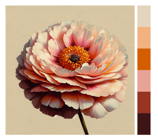
AI image generated in Kittl
Wildlife
The animal kingdom is filled with unexpected and eye-catching color combinations. You’ll find that, much like botanicals, wildlife colors are often both bold and balanced.

You can find all the photos above in Kittl - find them and more in our photo gallery and the Kittl AI Art library.
Warm and cool combinations
Combining warm and cool tones creates dynamic palettes with depth and dimension. For example, pairing a warm orange with a cool blue can result in a unique design that’s beautifully balanced between warm and cold.

Neutrals with a pop of color
Neutral tones such as gray, beige, or white serve as a subtle backdrop that allows bold colors to stand out effectively. By creating a clean and understated base, neutrals help draw attention to key design elements, making them more impactful. This strategy is particularly well-suited for sleek, modern designs where you want specific features, such as brand marks, calls-to-action, or focal points to take center stage.

The 60-30-10 rule
The "60-30-10 rule" is a design rule that's primarily used for interior design, but it's also a great tactic for graphic design. The "60-30-10 rule" divides a color scheme into three parts: 60% of the space should be a dominant color, 30% a secondary color, and 10% an accent color. This split variation in color quantity works to ensure a balanced appearance.
Extra tips for applying color palettes to design
Here are some bonus design tips for effectively incorporating different types of colors:
Neutrals
Neutrals provide a clean canvas that lets bolder colors shine. Plan to include neutrals such as white, gray, or beige in your palette to use as backgrounds or secondary elements.
Bold Tones
Limit bold colors to one or two hues in your palette. These hues will create visual interest and provide variety without overwhelming your designs.
Accents
Select colors in your palette to use as accent colors. Accent colors serve to break up an image, adding depth and interest. They should be used sparingly, as a way to complement the other colors in your palette.
Practical examples: Applying palettes to projects
Lastly let’s look at how you might use different palettes in specific design scenarios:
Branding
Create a palette that reflects the core values, tone, and personality of the brand. Since a logo symbolizes an entire brand and often makes a first impression, here are some practical tips for using colors effectively:
- Understand the brand’s personality: The colors you select should align with the emotions and message the brand wants to convey.
- Avoid trends: While it’s tempting to use trendy colors, they can quickly become outdated. Stick to colors that have lasting appeal and align with the long-term vision of the brand.
- Scalability: Your logo might need to work in small sizes, so ensure your colors are distinguishable even when the logo is reduced in size, and that your color choices look great in both full color and in black and white.
Web design
When applying color palettes to website design, it's important to ensure the colors not only enhance the visual appeal but also improve user experience and functionality. Here are some practical tips for applying color palettes effectively:
- Create a visual hierarchy: Use contrasting colors to distinguish important elements like headings, buttons, and navigation menus from the rest of the content. This helps guide the user’s eye and makes the site easier to navigate.
- High contrast for text: Ensure there’s enough contrast between background colors and text for easy readability. Light text on a dark background or dark text on a light background works best for body copy. Avoid color combinations that might strain the eyes, such as yellow text on a white background.
- Use accent colors strategically: Apply accent colors to draw attention to key areas like CTAs (call-to-action buttons) or promotional banners. This makes them stand out without overwhelming the user.
Event posters
When applying color palettes to event posters, the right use of colors can grab attention, convey the event’s mood, and ensure clarity. Here are some practical tips for applying color palettes effectively to poster design:
- Prioritize key information: Use bold or contrasting colors to highlight the most important elements, such as the event name, date, and location. This ensures that the essential details stand out immediately.
- Align with the event’s theme: Choose colors that reflect the tone of the event. For example, vibrant and energetic colors like red, orange, or yellow work well for music festivals, while more subdued tones like pastels or earthy colors suit calm, formal events.
- Keep it simple: Avoid overwhelming the viewer with too many colors. Limit the palette to 2-3 primary colors and use neutrals to balance and complement them. This keeps the poster clean and easy to digest.
Social media posts
When applying color palettes to social media posts, effective use of color can boost engagement, reinforce your brand, and make your content more visually appealing. Here are some practical tips for applying color palettes effectively to social media posts:
- Stick to your brand colors: Use your brand's primary and secondary colors consistently to reinforce brand identity. This creates a cohesive look across your profile and ensures your posts are instantly recognizable.
- Limit your color palette per post: Stick to 2-3 colors per post to avoid overwhelming viewers. Use neutrals like white, black, or beige as a base to balance bold colors and make your visuals clean and easy to absorb.
- Experiment with templates: Use customizable social post templates and integrate your color palette. This ensures professional-quality designs while saving time and maintaining consistency across all posts.
Get started: Steps to build your own color palette
Step 1: Define your goals
The key to selecting the best color combinations is understanding the goals of your project. Are you aiming for attention-grabbing visuals or understated elegance? Do you want to evoke excitement or calm? To get a better sense of your audience and make smarter design choices, try using customer insight tools to dig into their preferences, behaviors, and what they’re looking for.
The goal you define here is important - it will be your north star, driving your creative decisions. Here are 10 key questions to consider:
- What is the purpose of the design for which the palette is for?
- What emotions or message do I want to convey?
- Who is the target audience?
- Where will the design be used (digital, print, packaging, etc.)?
- What is the desired tone (formal, playful, minimalist, bold, etc.)?
- What is the primary medium (screen or print)?
- Are there existing brand guidelines or required colors?
- What visuals, themes, or reference materials inspire this project?
- What background color(s) will enhance readability and suit the overall design?
- What accent color(s) do you envision will highlight key design elements?
Step 2: Collect reference photos
Once your goals are set, collect reference photos to use for inspiration. This can help promote ideas, giving you a better understanding of what you like and don’t. Exploring how others use color combinations can also give you insight into how your own colors might appear in practice.
Check out platforms such as Pinterest to gather inspiration, or explore our AI image library and pre-made templates. These professionally designed templates are chock full of timeless classics and trending designs. You’ll find endless color palette inspiration.
Step 3: Choose the best color combinations for your palette
Start with basic color schemes and adjust for your specific needs. Using your base color as a foundation, create your palette by following traditional color schemes and adjusting hues, tints, and shades. Or you can experiment with a few other methods and create a custom palette. With this strategy, you can create unique palettes that align with your vision. Your base colors set the tone for your entire palette. They should align with your project’s goals and audience.
Step 4: Save your color palette for future use
Once you've decided on your color palette, you need to save it for future use. You want to do this for two main reasons:
- Saving your color palette will save you time in the future - no need to try to keep recreating it.
- Ensure 100% color palette accuracy in future designs and maintain a consistent brand image.
In Kittl, you can easily save colors, styles, fonts, and more in a brand kit. Build a complete brand kit and access it anytime to help seamlessly create designs quickly and efficiently. See the image below of saving brand colors in action:

Ready to experiment? Here's your design challenge
Now that you’ve learned how to create stunning color palettes, it’s time to put your skills into action! Head to Kittl and practice building a palette using a reference photo. This hands-on approach will help you get comfortable with graphic design tools like the eye-dropper and teach you how to start a project with ease.
Challenge: Learn from the pros! Whether it’s the soft pastels of Impressionism or the vibrant tones of Pop Art, translating a famous work of art into a modern design template can lead to surprising results.
Take a photo or screenshot of your chosen image from a platform like Pinterest, and upload it to Kittl. From there, extract the color palette and apply it to a design template. This experiment will challenge you to think beyond traditional color theory and let the emotional power of art guide your work.