


Product
Templates
Resources
Company
Home
Blog
Tutorials
How to Design a Fantasy Book Cover FREE | Design Tutorial
How to Design a Fantasy Book Cover FREE | Design Tutorial
Creating a book cover isn’t an easy job. The cover should look stunning and convey what the book is about, so getting all those elements in line can be a challenge. This is doubly true when it comes to fantasy books.
Fantasy is a colorful genre dominated by imagination and unusual ideas, and a fantasy book cover needs to reflect just that. While designing such a cover is quite hard without the proper tools, you can actually do it with relative ease using Kittl. This tutorial will show you how to create an attractive cover with the tools available from Kittl. If you don't have Kittl yet, you can sign-up for free now and follow along with the process.
1. Set Up Your Canvas
Since we’re making a book cover, we’ll set up our canvas to a common ebook or flipbook size: 2560 pixels high and 1600 pixels wide. When you open a new Kittl project, you can access the artboard size menu by clicking the gear icon in the upper right. For those also interested in enhancing their storytelling skills, enrolling in creative writing courses can provide valuable insights into crafting compelling narratives.

2. Select the Right Font
When you set up your canvas to the right size, it’s time to insert the most important element: the book title. For this example, our title will be “The Dark Forest.” You can insert the text using the left sidebar and the “Text” option which is the third one from the top.
In this case, we won’t type in the entire title at once. Rather, we’ll insert the first word – “The” – and then copy it two times. Each copy will be placed below the previous word and changed into “Dark” and “Forest,” respectively.
We’ll use the Royal Signage font for the word “Forest” due to its ornate style and many alternative letters called Glyphs. To insert the Glyphs, select the first letter, go to the right sidebar, and click the stylized “A+” icon. From that menu, you can select a special “F” glyph that will give the lettering a special style. We’ll do the same with “T,” the last letter of the word.
We can create an additional fantasy effect by resizing the other words and fitting them around the stylized “Forest.” Finally, we can add more effects and custom letter glyphs to the word “Dark.”

3. Place the Author’s Name
The author’s name is the other important piece of text on a book cover. The most common location for this text is at the bottom of the cover, so that’s where we’ll put it in our example.
The easiest way to insert the author’s name will be to copy the word “The” from the title and drag it to the bottom. In this case, our author will be named Wilma Writer. We can also add a smaller descriptive piece of text above the name – we’ll use “From No. 1 Bestselling Author”. All that’s left is to tweak the letter size and ensure the text is centered properly. You might find this guide on how to write a book helpful in developing your story before focusing on its presentation.
Certain fonts like the default Blackriver we used in the example are called variable fonts. This means you can resize the lettering without changing the actual font size. Access this option from the right sidebar.

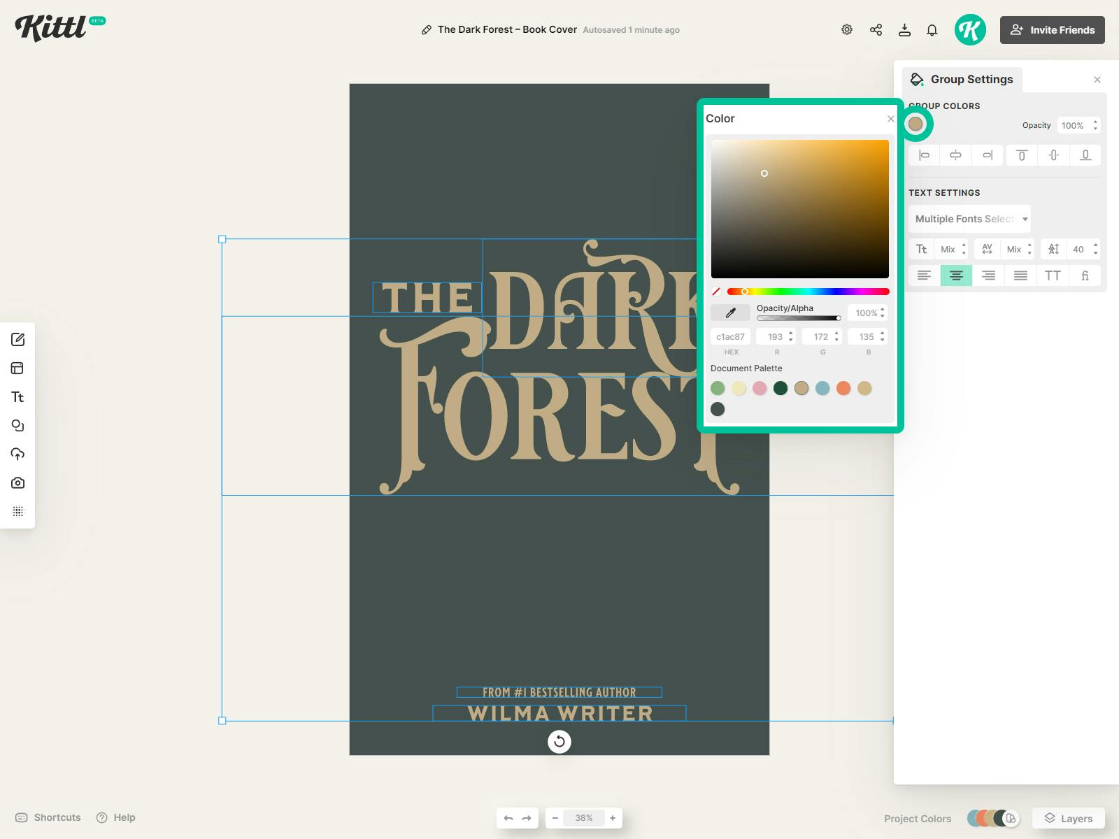
4. Choose the Colors
Once the text is in place, we’ll give it some color. Since the title of our book is “The Dark Forest,” we’ll go with a dark green background and a gold-yellow to give a more fantasy vibe to the lettering. Both color settings will become available once you select the elements. The most important thing here is to make sure the colors contrast nicely so that the text remains visible.
5. Frame the Cover With Illustrations
Now it’s time to insert some descriptive illustrations to our cover. For this, we’ll use the “Add Elements” menu from the left sidebar. We’ll go to the “Illustrations” tab and, since the main theme of the book is forest and nature, choose some floral illustrations.
In particular, we’ll choose the Art Nouveau Flowers. Don’t worry if you don’t see them right away – you’ll need to scroll down a bit to find the section. You can also search for this section, which will be the easier option. The section is full of interesting floral designs which we’ll use to frame the cover.
If you want to create a symmetric design as we did in the example, you can simply copy an element and flip it to get an exact mirrored version.

6. Fill the Space With Additional Elements
As you can see, there’s still plenty of empty space in our graphic. We’ll fill it out using some additional elements. In this case, we’ll search the “Add Elements” menu for an image of a raven. If you do the same, you’ll find plenty of silhouettes and images of ravens.
We’ve chosen a raven because of its symbolic and atmospheric effect. For this example, we decided to make the bird look like it’s resting on the letter “R” in “Dark.” We also adjusted the element’s color to match the text.
We didn’t want to maintain perfect symmetry throughout the cover, so we added some more floral motifs.

7. Add a Border
When it comes to borders, we want to create a subtle frame for the cover. To do this, we went to “Add Elements” on the left sidebar, then the “Ornaments” tab, and, finally, the “Corners” menu, where we found some decorative metal-looking corners.
Once the corners are in place, we’ll attach them with lines, which you can find in “Basic Shapes.” Make sure to give them the same color as your corner elements.

8. Insert a Badge
You’ve probably noticed that we left some empty space in the middle of the cover beneath the title. We reserved that space for a badge that might contain the author’s initials. Such badges are often a part of the book cover design, so we decided to insert one into our project.
You can find badges under “Add Elements,” the “Shapes” tab, then the “Badges” menu. For this case, we decided to create a monogram of our author. To do that, we first inserted the badge and then used the text tool. Kittl has a special monogram font that’s ideal for this purpose. We simply selected the monogram font and entered the author’s initials, in this case, “WW.”

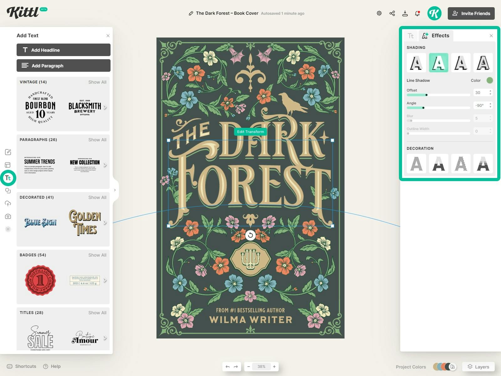
9. Create Text Shadow and Decorations
Let’s apply shading to the lettering to make our title pop. Select the text you want to add an effect to and go to the "Effects" tab. Click "Line Shadow" and give it an offset of 30 to make to it stand out.
For the color, we chose a shade of green to match the overall look.
At this point, we decided to insert some additional effects into the text. First, we selected the word “Forest” and chose the Arch option from the “Transformation” menu in “Text Settings.” We adjusted the curvature to give the word only a slight curve. Then, we took the word “The” and went with the Rise option in the same menu. By dragging the nodes that appear beneath the word, we made it follow the line of the stylized letter “F” in “Forest.”
Finally, we added a border to the text from the “Text Settings” menu, made it a lighter shade of gold, and increased its weight to about 45.
10. Adding Texture to the Cover
We’ll wrap the project up by adding some texture to the cover. Open up the texture panel in the left sidebar, apply the Marble texture and choose the 'Color Burn' effect with and opacity of 30.This will create a deeper and more forest like green tone.
We just want to apply the texture to the background, so we will move it to the back in the layers panel.

The Fantasy Book Cover Template in Kittl

Related articles

Vintage
How to Create an ’80s Retro Poster Design | Design Tutorial
Retro never goes out of fashion. Today, retro style is still going strong, especially in poster desi...

Tutorials
How to Fit Text Into a Shape Silhouette
By using Kittl's warp effects, you can easily fit text into silhouettes that are perfect for any pro...