If you’ve read our guide on balance in art, you already know that visual harmony isn’t just about making things look pretty—it’s about how elements interact to create stability. But here’s the thing: balance doesn’t exist without visual weight.
Visual weight is one of those quiet forces in design that can completely shift how a piece feels. It influences what stands out, what fades into the background, and how someone reads your layout—sometimes without them even realizing it.
A design without balance would just be something that “fills the space”. Designing posters, interfaces, or illustrations as you keep visual weight in mind can make the difference.
So what exactly gives something “weight” in a design? And how do you know if you’ve got it right? Let’s explore.
What is Visual Weight?
Visual weight refers to the ability of an element (like a shape, color, or object in your design) to draw attention or appear important.
A lot of what makes something feel “heavy” or noticeable comes down to how we use space, contrast, and repetition—core ideas from the principles of balance and contrast that every designer leans on, whether they realize it or not.
Throughout our discussion of balance, we kept coming back to the idea of visual weight – the notion that some elements look “heavier” or more dominant than others.
But visual weight isn’t something you can measure with a ruler or scale; it’s a perceptual property. Essentially, it has everything to do with how we assess the “heaviness” of elements in a composition.
An element with high visual weight pulls your eye toward it, just as a heavier object would pull down harder on a physical scale.
What are the factors affecting Visual Weight?

Several factors influence how “heavy” or noticeable an object appears in a layout. Think of it like a scale: size, color, contrast, and position can all tip the balance in one direction or another.
And the more you understand what contributes to visual weight, the more control you have over how people navigate your design.
Let’s break down the core contributors to visual weight and how each one can shift your viewer’s focus in subtle (or bold) ways.
- Size: Bigger elements generally carry more weight than smaller ones. A large circle will usually feel heavier than a tiny circle.
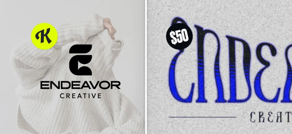
- Color and value: Bold, saturated, or dark colors tend to feel heavier than light or desaturated (pale) colors. For example, a bright red object grabs attention (heavy weight) compared to a pastel pink object of the same size. Similarly, a black shape on white feels heavier than a light gray shape. The strategic use of accent colors in text or shapes can draw the eye to key elements, enhancing the overall visual hierarchy of the design
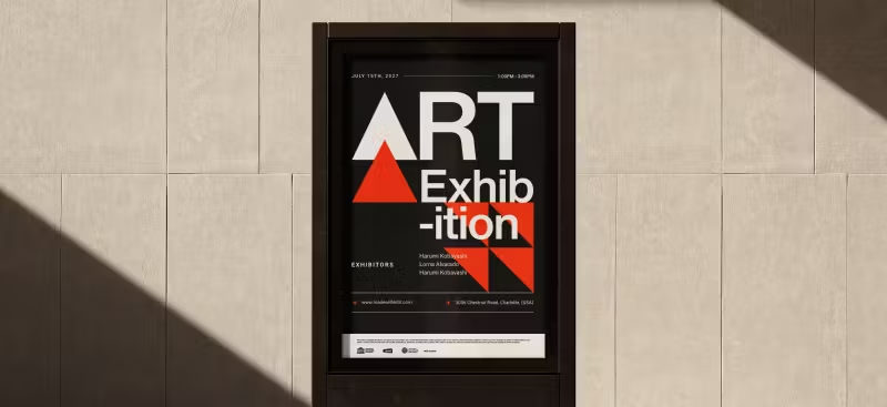
- Contrast: An element that strongly contrasts with its surroundings (in color, value, or texture) has more weight. A lone yellow square on a field of black is very eye-catching (high contrast = high visual weight).
- Shape: Certain shapes inherently attract more attention. For instance, regular, solid shapes can seem heavier than irregular or open shapes. A solid circle or square might feel weightier than a complex jagged form of the same area, because the eye reads it as a cohesive mass. Additionally, human-recognizable shapes (like a silhouette of a person) might draw attention due to meaning, thus acting “heavy” in context.
- Texture and detail: An object with intricate detail or texture can command more attention (weight) than a flat, simple object. Our eyes linger on detailed patterns.
- Orientation and position: Believe it or not, even the orientation plays a role. A diagonal line or element often has more dynamic visual force than a horizontal or vertical one. Diagonals suggest movement and thus draw the eye (giving them weight). Position matters too: elements placed at the edges or top of a frame can sometimes feel heavier because they seem like they “want” to fall off the composition (introducing tension). Conversely, elements nearer the center or grounded at the bottom might feel a bit lighter in influence. Also, an element isolated in empty space might attract attention (weight) because nothing competes with it, whereas that same element in a cluttered area might not.
- Subject matter: In representational art, what the element is can affect weight. For instance, a face or a figure in a painting will usually draw the viewer’s focus more than a random object, giving it visual weight beyond its formal properties. In design, an icon or logo might have more weight than a decorative flourish, because we inherently prioritize meaningful content.
How to assess Visual Weight in design?

Unlike physical weight, you can’t put a shape on a scale and get a number. Visual weight is assessed relative to other elements.
A practical method is the squint test or blur test: squint your eyes or step back until details fade – the parts that still stand out have the most visual weight.
Another trick is the “blink test” or memory test: look at the design for a few seconds, then close your eyes – which elements do you remember first? Those likely had the highest visual weight. If an element is supposed to be secondary but it’s the first thing you recall, it might be too heavy and steal focus.
Designers also use layout tools like grids and guides to balance visual weight (for example, aligning a heavy element closer to the center can reduce its imbalance, much like sliding a heavy person toward the middle of a seesaw).
Some even convert their design to grayscale to judge the distribution of light/dark, which often correlates to weight.
A more analytical approach is to list out each element and consider the factors: e.g., “Element A is red, large, and high-contrast on background; Element B is small, gray, low-contrast.” Clearly A has more weight than B. To balance, you might need multiple Bs to counter one A, or tone down A.
Importantly, visual weight is perceived, not absolute. It can also be influenced by context – for instance, a small red dot on a huge white canvas can feel very heavy simply because it’s the only element (so the context gives it weight).
That’s why designers develop an eye for comparing elements within a design rather than assigning fixed values. You don’t say “a circle = 5 weight units” in general; you say “this circle feels heavier than that triangle in this specific layout.”
One tip for assessing visual weight is to leverage software tools or sketches: move things around and see how the balance changes. If you swap two shapes and suddenly the design feels off, you’ve redistributed weight in a less effective way.
Another tip is to get a fresh set of eyes (or flip the design horizontally like a mirror) – sometimes we become so accustomed to a layout we don’t see imbalances that a new viewer would.
Some studies in vision science relate visual weight to where our eyes look first in an image. Eye-tracking research can show “hot spots” of attention. Those hot spots often correspond to the visually heaviest elements. So in a way, that’s a scientific measure of visual weight – by tracking viewers’ eye movements!
Visual Weight in art: The key to smarter design choices
Once you become aware of how visual weight works, you’ll start noticing it everywhere — in posters, packaging, websites, and even paintings.
It’s the reason your eye lands on a bold headline or a vibrant image first, and why a design might feel a little “off” even if everything is technically aligned.
Understanding the factors behind visual weight empowers you to build better compositions, refine your layouts, and guide your viewer’s attention with intention. Whether you’re adjusting scale, contrast, or placement, these small changes can have a big impact on how your design performs.
And if you want to put those techniques into practice, Kittl makes it easier to play with elements like scale, opacity, and spacing — so you can get a better feel for visual balance without second-guessing every move.
The more you apply it, the more instinctual it becomes. Trust your eye, stay curious, and keep refining. That’s where great design begins.