Product
Templates
Resources
Company
Home
Blog
Vintage
How to Easily Make Vintage Sanborn Map Graphics | Design Tutorial
How to Easily Make Vintage Sanborn Map Graphics | Design Tutorial
Vintage Sanborn maps have something magical about them. The style and design look exquisite on their own, even more so today when we look at Sanborn graphics with nostalgia.
Sanborn covers take a long time to make, but they’re so unique and stylish that people naturally want to replicate them. However, if you’ve tried to create a Sanborn design, you know how hard it is to find just the right fonts and elements for the project.
Luckily, Kittl just released an entire set of Sanborn assets. With unique fonts, frames, and recognizable thin flourishes, making a Sanborn poster became much easier.
This tutorial will take you through each step of making a Sanborn graphic with Kittl. And if you don’t have Kittl yet, don’t hesitate to sign-up for free. You can set up your account in a matter of minutes and start following along.
1. Create a New Kittl Project
Once you sign up to Kittl, click “New Project,” and you’ll get a blank canvas to begin your creation. You can select the cog icon to open project settings. From there, select the orientation and size of the graphic. You can also make the document custom size or enable the grid.

2. Add Your Text
The first thing you’ll want to do is add the central text. To get started, hit “T” on your keyboard or go to the left sidebar and select “Text.” You’ll see a rectangle appear in the center of your canvas. Now you can type whatever text you want.
For this tutorial, we’ve decided to create a Chicago Sanborn poster, so our main text will be “Chicago.”

3. Edit the Text
Right now, the text doesn’t look like much. It’s time to edit it into something much more impressive.
To edit your text, you’ll use the “Text Settings” toolbar that popped up on the right when you started typing. The options here, from top to bottom, are:
- Text color with opacity and border weight
- Orientation, represented by six icons right below the “Border Weight” slider
- Text settings, which include three rows of text formatting options
- Transformation section with different effects
The first thing you’ll want to do is change the text font. You can find it under “Text settings” with Roboto as the default. Click the font box to get the drop-down menu and find Headstock. This is one of the unique Sanborn fonts on Kittl, and it will be a great choice for this session.
Select “Angle” from the “Transformation” section to give your text that authentic Sanborn tilt. The text will shift immediately, and you’ll see a line appear beneath it. Drag the endpoints of the line to change the tilt angle.
Info Box: To resize your text, select it, hold the Alt key, and drag one of the corner boxes. This way, you’ll increase or decrease the text while leaving it in the center of your canvas.

4. Create Some Sanborn Elements
Kittl has a brand new collection of Sanborn elements. You’ll find them in the left toolbox under “Elements.”
In the “Add elements” menu, you’ll see a search box and four categories underneath it: Shapes, Ornaments, Illustrations, and Abstract. Choose “Ornaments,” then scroll down until you get to “Sanborn.”
You can expand the menu by clicking on the right-facing arrow. This will extend the menu across the entire page. If you want to enter the list of Sanborn elements, click “Show All.”
Once you’re viewing the elements, you can add each one you like to your graphic simply by clicking on it. Go ahead and insert several aspects into your project.
You can delete a part of an element by creating a box, placing it over the part you don’t need, and coloring the box in the same color as the background.

5. Play Around With Text Effects
Our graphic is starting to look better already, but we’re only halfway to the goal. The next thing we’ll do is add some text effects to give it a more vintage look.
Select your text, go to the right sidebar, and choose the “Effects” tab. It’s the only other tab other than “Text Settings.” You’ll see two categories in the Effects menu: Shading and Decoration.
Under “Shading,” you can select four types of shadows: Drop, Line, Block, or 3D. Once chosen, you can customize it further by tweaking the offset, angle, blur, and width. You can also choose different colors for the shading effect.
For our example, we used the Block Shadow in black color with an offset of 5 and an angle of -45 degrees. We also changed the text fill color to white in the “Text Settings” tab.
In the “Decoration” section below, you can find different pattern types to fill the lettering of your text. There are Horizontal, Color Cut, Oblique Lines, and Fading Color Cut options. Once you pick the option you like, you can adjust its color, weight, and distance.
We went with Oblique Lines at 2% weight and 1% distance. We colored the lines black. Finally, we went back to “Text Settings,” added a border weight of about 14, and colored the border white.
If you tweak your text effects similar to ours, you’ll see how the Sanborn style is starting to show up. Now we’re getting somewhere.

6. Make a Double Text Shadow
You can make another shadow for your text that will really give it that vintage look you’re going after. This can be done by selecting the text and duplicating it. Hold the Alt key and drag the text to do just that.
Next, go to “Text Settings” and move the “Border Weight” slider all the way to the left to remove the border. Now select “Effects” and click on the chosen shading type to remove that as well.
Finally, right-click on the duplicated text and choose “Backward” from the menu. This will send the duplicate one layer behind the rest of your graphic.
Once you’ve done all this, you’ll need to drag the duplicated text until it looks like a secondary shadow beneath the original. You can use the arrow keys on your keyboard instead of dragging with the mouse.

7. Insert Filler Text (And Place It Well)
Adding more text to your graphic is quite easy. You can get the same style of text without having to tamper with the shading, borders, and other effects.
First, you’ll need to duplicate the main text again. Then, deselect “Angle” in “Text Settings” and double-click on the text box to start typing the new text. When you finish typing, simply click on a blank spot, and you’ll see the new text appear.
Since the text will be the same size as the original, you’ll need to decrease it by dragging the corner box. Don’t forget to hold Alt while doing this to keep the text in the center. Then, drag the new text to where you want to position it.
It wouldn’t be a bad idea to change the font, too. There are other Sanborn fonts to choose from in “Text Settings.”
For our additional text, we wrote “The Windy City,” placed it between two decorations, made the text gray, and used the Old Erika font. Of course, you can add more text and play around with the settings to get different effects.

8. Create More Vintage Ornaments
Now that you have the main components, you can add more ornaments and adjust the existing ones. It’s important to choose elements that go well with the overall design.
When handling ornaments, you’ll likely be using some handy commands and shortcuts.
By now, you’ve probably memorized the Alt+drag option to duplicate an element. You can also rotate pieces more precisely by holding Shift and dragging the curved arrow located beneath the component. Also, you can flip elements horizontally and vertically through the right-click menu.

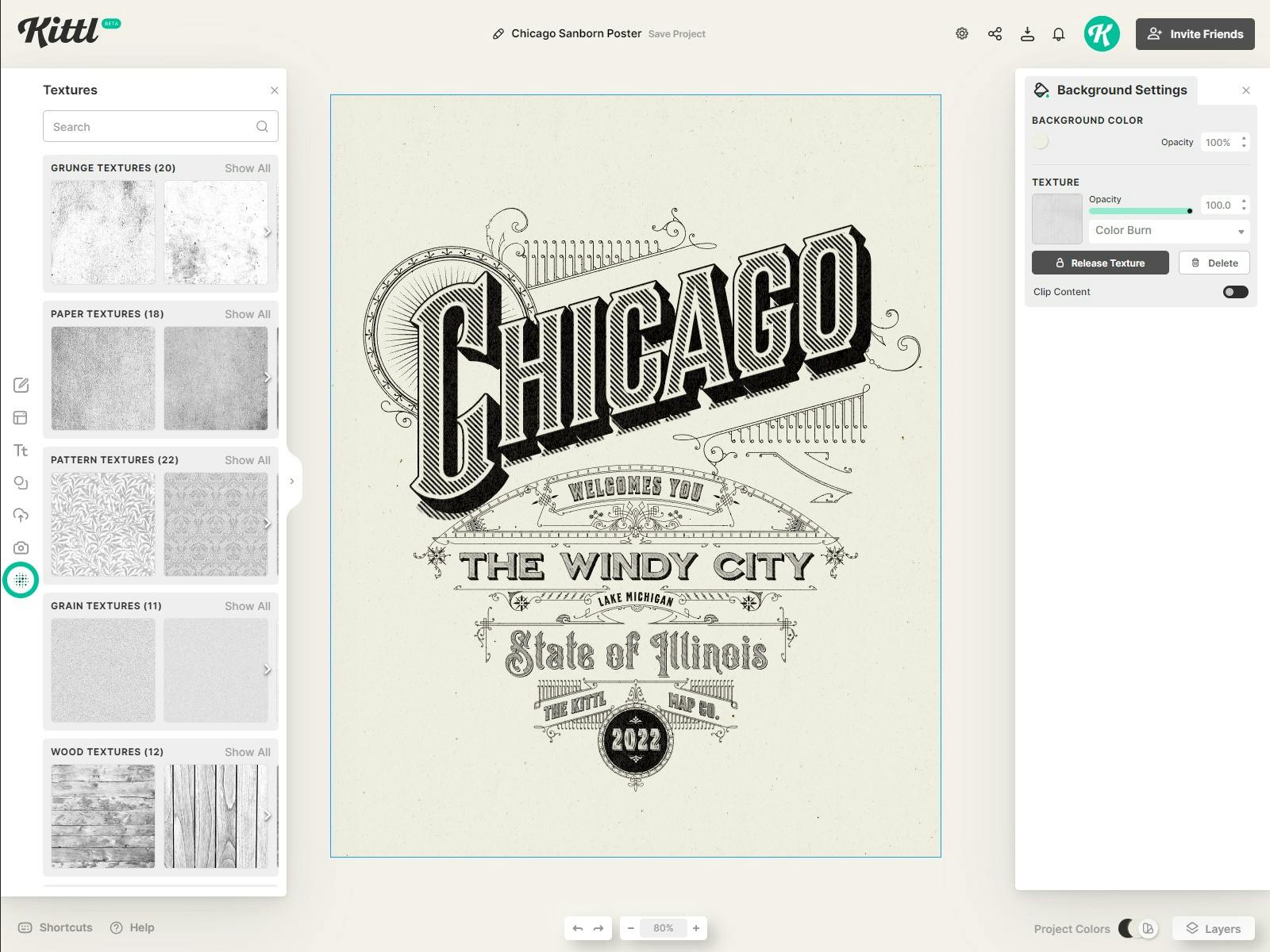
9. Edit the Colors and Texture
To give your project that final touch, you should tweak the color and texture of the background. You can pick the color by clicking on the background or deselecting any other elements. At that point, you’ll see the “Background Settings” toolbox on the right, and “Background Color” will be the first and currently the only option.
After you choose the color, go to the left sidebar and click on “Textures.” It is the bottom-most icon on the menu. From here, you can select a texture you like, which will be applied to the graphic automatically. You may also tweak the texture using the “Background Settings” menu.