Product
Templates
Resources
Company
Home
Blog
Tutorials
Why your LinkedIn profile is forgettable (And how to fix it in minutes)
Why your LinkedIn profile is forgettable (And how to fix it in minutes)
Your LinkedIn profile isn’t just a résumé—it’s your digital storefront, your portfolio, and your first impression. But let’s be honest—most profiles become forgettable. Not because the designers behind them aren’t talented, but because LinkedIn makes good design surprisingly frustrating.
Banners get cropped in weird ways, profile pictures sit right on top of important design elements, and post layouts? They blend in with the sea of other posts.
And honestly, who has time to wrestle with all that? You’re busy designing for clients, meeting deadlines, and juggling a dozen projects already. Sitting down to tweak your LinkedIn profile shouldn’t feel like another unpaid gig.
That’s where a little creative strategy (and the right tools) come in. With Kittl, you can skip the formatting headaches and quickly grab a LinkedIn banner template that actually fits, edit your profile picture that frames you just right, and find the best LinkedIn post template that look clean and professional every time—without spending hours fixing pixels.
Because if you’re putting out great work, your profile should at least do you justice. And no, it doesn’t have to take all day. If your profile isn’t getting the attention it deserves, it’s probably because of one (or all) of these reasons. Let’s fix that.
Table of contents
- Reason 1: Lack of personal branding on your banner
- Download LinkedIn Banner Templates
- Reason 2: Your profile picture doesn't work out
- Good Examples of LinkedIn Picture and Banner
- Reason 3: Your post blends in with other posts/a>
- Download LinkedIn Post Templates
- Reason 4: Different branding and colors in your profile
Reason #1: Your banner says nothing about you
Your LinkedIn banner is prime real estate, yet too often, it’s left blank, filled with a random stock image, or worse—cropped into oblivion. If your banner isn’t reinforcing your expertise or aesthetic, it’s a wasted opportunity.
And LinkedIn doesn’t make this easy. What looks perfect in your design tool gets cropped weirdly on mobile. Your profile picture blocks key elements, and LinkedIn’s compression dulls colors and blurs details. No wonder designers push it to the bottom of their to-do list.
🔧The fix
Your banner doesn’t need to be over designed—it just needs to be intentional. Here’s how:
- Keep it simple, but strategic. A strong tagline, a polished color scheme, or a clean, recognizable design speaks louder than clutter.
- Think about balance. Your profile photo will overlap the banner—don’t let it cover important details.
- Be mindful of contrast. Low-contrast banners might look sleek in your editor, but LinkedIn’s compression can kill readability.
Take this as an example:
The trick is designing with LinkedIn’s quirks in mind instead of fighting them. Normally, that means trial and error—uploading, adjusting, re-uploading (repeat forever). But Kittl makes this process way easier:
- One-click LinkedIn templates ensure your banner fits perfectly—no awkward cropping, no lost elements.
- Instant background swaps & AI Background Remover help you refine the aesthetic in seconds.
- Our Brand Kit keeps fonts, colors, and assets consistent across all your LinkedIn visuals—so everything looks sharp without extra effort.
Or just start with these ready-made templates from us:
As Paula Scher said, “Design is the art of planning, and it is the art of making things possible.”
Your banner should do exactly that—elevate your profile without eating up your time.
It all comes down to personal branding. Want to learn more about it? Check out our FREE masterclass here👇
Reason #2: Your profile picture isn’t working for you
As a designer, you’re used to making things look good. But somehow, choosing a LinkedIn profile picture always feels harder than it should be.
Maybe you’re using an old headshot that doesn’t quite match your aesthetic anymore. Maybe you went with a logo, an artsy crop, or a moody shot that looks great in a portfolio but feels awkwardly out of place here.
And honestly, we get it—LinkedIn isn’t exactly the most inspiring platform. It’s tempting to just throw something up and move on.
But here’s the thing: your profile picture isn’t just a formality, it’s part of your brand. If someone lands on your profile and the vibe is off, even slightly, they might scroll away before they even check out your work.
🔧The fix
Forget the overly polished, corporate-style headshot. Your LinkedIn profile picture should feel like you. But there’s a balance: it should also feel intentional. A few things to consider:
- Clarity over clutter. A clean, well-lit photo with a background that doesn’t fight for attention keeps the focus where it should be.
- Make it recognizable. Your profile picture shows up everywhere. It’s in the comments, in search results, in messages. If it’s too detailed or too zoomed out, it won’t hold up at smaller sizes.
- Match your brand’s energy. If your designs are bold and playful, a stiff, neutral-toned headshot might not feel right. If you keep things minimalist and modern, a chaotic background could be sending the wrong message.
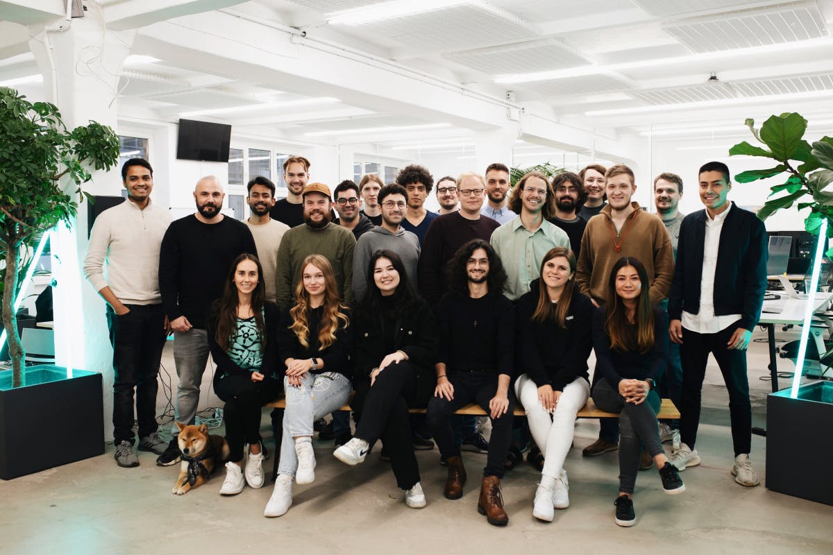
See we, at Kittl, keeps their profiles looking sharp:


Luckily, you don’t have to go through 50 different versions in Photoshop just to get this right. Kittl’s Background Remover lets you swap, clean up, or tweak your backdrop in seconds so your profile picture actually fits your aesthetic without a full reshoot.
Because honestly...you’ve got better things to do than obsess over a LinkedIn crop.
Reason #3: Your post looks like any other posts
We’ve all mindlessly scrolled through LinkedIn. A wall of text. A generic, overused template. A mildly inspirational but forgettable graphic. Scroll.
It’s not that people aren’t posting interesting things, it’s just that LinkedIn’s layout makes everything blend together. And as a designer, that’s the last thing you want.
Your work deserves more than a passing glance, but when every post looks the same, standing out takes effort.
🔧The fix
- Text-only posts rarely win. Visuals are processed 60,000 times faster than text—and posts with strong visuals get up to 80% more engagement. If your content is buried in paragraphs, it’s likely getting ignored.
- Make your posts skimmable. A study by Yahoo and OMG shows Gen Z loses interest in just 1.3 seconds—but let’s be honest, nobody wants to keep reading if nothing grabs them in the first two seconds. Use bold takeaways, clear hierarchy, and strong visuals to make it effortless to digest.
- Say something that actually matters. No one needs another generic “Consistency is key!” post. Talk about real insights designers care about—like how to handle nightmare clients, whether AI is pushing out human creativity, or why some design trends stick while others die overnight
Something like this would just do it:
At the end of the day, designers know the power of great visuals—but LinkedIn makes standing out harder than it should be.
That’s why Kittl’s LinkedIn post templates make formatting less confusing, so you can focus on what you’re saying while making sure it actually gets seen.
Reason #4: Your profile feels like a moodboard gone wrong
Ever clicked on a LinkedIn profile and felt like you were looking at three different people? The banner says one thing, the profile picture says another, and the posts? A total wildcard. It’s not that the person isn’t talented—it’s just that LinkedIn doesn’t exactly make consistency easy.
Between weird crop sizes, shifting layouts, and zero built-in branding tools, keeping things looking polished across your profile takes more effort than it should. And let’s be honest—who has time to manually tweak every LinkedIn update like it’s a brand identity project?
🔧The fix
- Stick to a core color palette and font set. If you’ve got a signature style, use it. Your LinkedIn should feel as intentional as any project you work on.
- Make small, consistent choices. Matching color accents, typography, or even image treatments can make a profile feel effortless but cohesive.
- Ditch the manual adjustments. Normally, keeping everything aligned would mean resizing, exporting, and tweaking every post. But Kittl’s Brand Kit stores your go-to fonts, colors, and assets—so your visuals stay sharp and on-brand without the extra effort
See how a polished, consistent LinkedIn profile can look like:
Your profile isn’t just a formality—it’s part of the bigger picture. And if people are paying attention to your work, they should be able to recognize who it belongs to, no matter where they see it.
Getting your profile just right doesn’t have to be a full-time job
Most designers don’t have forgettable LinkedIn profiles because they lack skill. It’s because LinkedIn makes design choices frustrating, client work always comes first, and honestly—who has the time?
The good news? Getting it right doesn’t have to feel like another unpaid project.
Kittl isn’t just another design tool—it’s the first all-in-one creative platform built for designers who want both precision and ease. Everything from text effects to vector editing to high-quality mockups happens in one intuitive space—so you can create with power, without the usual friction.
With LinkedIn-ready templates, instant background adjustments, and a fully integrated Brand Kit, Kittl ensures that every banner, post, and profile element looks cohesive without extra effort.
Because if people remember your work, they should remember who’s behind it, too.
Kittl was built by designers, for designers, it doesn’t just give you tools—it gives you efficiency, creative flexibility, and a workflow that makes sense.
Related articles

Tutorials
How to make your 4:5 Instagram grid work in 2025
The new Instagram updates include off-center follower counts and the awkward name placement at the t...

Tutorials
How to build a personal brand: 20 tips for designers and creators
For designers and creators, building a strong personal brand isn’t just about standing out – it’s a ...

Tutorials
How to find custom Instagram Reel Covers inspiration that leads to standout designs
If you’re serious about growing on Instagram, custom Instagram Reel covers inspiration is something ...


