


Product
Templates
Resources
Company
Home
Blog
Design
Gestalt principles of design: 7 visual rules every UI designer should know
Gestalt principles of design: 7 visual rules every UI designer should know

Ever looked at a design and instantly “got it”—even before reading the text or fully processing the layout? That’s Gestalt at work.
Gestalt principles (sometimes called Gestalt laws of perception), originally rooted in psychology, explain how we naturally group, separate, or complete visual elements to form a whole picture—even if the details are missing or messy.
The word “Gestalt” itself is German and loosely translates to “shape” or “form.” But it’s more than that. In design, it’s the idea that the whole is greater than the sum of its parts—and our brains are wired to spot that whole, whether it’s a logo, a website layout, or an abstract poster with clever spacing.
Table of contents
- Why do Gestalt principles matter for designers?
- What are the 7 main Gestalt principles of design?
- 1. Proximity: Group things by closeness
- 2. Similarity: Match style to signal connection
- 3. Continuity: Lead the eye along a path
- 4. Closure: Fill in the blanks
- 5. Figure-Ground: Make the main thing pop
- 6. Common Fate: Show movement to group elements
- 7. Symmetry: Bring balance to your layout
Why do Gestalt principles matter for designers?
Because when you understand how people perceive visual information, you can design with intention. You’ll know how to lead the eye, create balance, and spark instant recognition—without overwhelming your audience.
You’ll stop designing based on “vibes” alone and start designing based on how the mind actually works. If you want to go broader, it’s also worth exploring the core design principles every designer should know.
Whether you're laying out a killer UI, building an ad campaign, or tweaking a brand identity, mastering Gestalt principles of design is like unlocking the blueprint to visual harmony. It’s the psychology behind why something feels right.
And guess what? Once you spot these principles, you’ll start seeing them everywhere—from subway signs to cereal boxes to your favorite movie posters.
What are the 7 main Gestalt principles of design?
Great design isn’t just about pretty pixels. It’s about how people see and understand those pixels.
That’s where Gestalt principles come in. They’re the psychology-backed rules that explain how we visually group stuff, make sense of layouts, and instinctively know where to look.
If you're building UIs, working on brand systems, or polishing product visuals, mastering these 7 core Gestalt principles will help you design experiences that just click for your users.
Let’s walk through each one—what it means, how it shows up in real-life interfaces, and why it matters.
1. Proximity: Group things by closeness

What is the principle of proximity in design?
Proximity is all about how close elements are to one another—and how our brains love to group things that are near each other.
It’s one of the most powerful visual shortcuts we use without even thinking about it. If elements are placed close together, we automatically assume they’re related—even if they’re totally different shapes or colors.
Think about a grid of grey dots. On the left, they’re tightly clustered. On the right, they’re spaced out. Even though every dot is the same, we see the tight group as one unit and the spaced-out dots as separate. That’s proximity at work.
In UI design, proximity plays a big role in helping users scan and comprehend content quickly. For example, form fields placed directly below their labels feel logically connected, while spacing between field groups helps users distinguish different sections.
Real-world examples:
- E-commerce cards on sites like Walmart group product images, prices, and names in tight layouts, with spacing between cards.
- News layouts like Vice News use proximity to show what image belongs to which headline by simply placing them close together.
2. Similarity: Match style to signal connection

How does the Gestalt similarity principle influence layout?
Similarity explains how we group things that look alike, our brains lump them together. When elements share similar shapes, colors, or fonts, users group them automatically—making it especially useful when you're figuring out how to pair typography styles for consistent UI cues.
This makes similarity one of the fastest ways to communicate meaning in your design without explaining anything.
Picture a grid of evenly spaced squares, some yellow, some gray. Even though the spacing is uniform, the yellow ones feel like one group and the gray ones another—just because of color. That’s similarity overriding layout.
In UI design, this is how we build trust and predictability. Users know that blue, underlined text means a link—or that all warning banners in red mean “pay attention.” By keeping styles consistent across the interface, users quickly learn what belongs where and what does what.
Real-world examples:
- GitHub’s homepage: uses different background colors to separate sections, but consistent blue text styling for all hyperlinks.
- Websites with uniform button styles and iconography help users immediately recognize interactivity across the entire experience.
3. Continuity: Lead the eye along a path

What is the Gestalt principle of continuity in design?
Continuity (also called continuation) is all about flow. Our eyes love following a line or curve. If elements are aligned—even across small gaps—we perceive them as connected and part of the same group or story.
Imagine yellow dots forming a smooth curve through a sea of white ones. Even if a yellow dot is surrounded by white, you still follow the yellow curve with your eyes. It’s the alignment, not the color or shape, that defines the connection here.
In interface design, continuity is essential for guiding user behavior. Aligning a set of steps in a row creates a logical flow. It’s used heavily in carousels, timelines, and multi-step processes—where visual rhythm encourages movement and interaction.
Real-world examples:
- Amazon’s “related items” carousel aligns products in a horizontal row to nudge scrolling.
- Multi-step checkouts use connected elements (like progress bars) to visually walk users through the journey.
4. Closure: Fill in the blanks

How does closure work in Gestalt principles of design?
Closure is the brain’s way of filling in the blanks. When we see incomplete shapes, we don’t freak out—we finish them mentally. This principle is everywhere in modern design, especially when we want to simplify visuals or create curiosity.
Take three Pac-Man-like shapes arranged like triangle corners. Even though no triangle is drawn, your mind connects the dots and sees one. That’s closure—our brains love finishing what’s suggested.
In UI design, closure shows up in logos, loaders, and UI peeks. A partially visible element signals there’s more beyond the current view. A spinner that’s only a partial circle still reads as a full loop in progress.
Real-world examples:
- WWF’s panda logo uses simple black patches to imply the full bear shape.
- On mobile, horizontal carousels often tease the next card by showing a sliver—closure makes us want to swipe.
5. Figure-Ground: Make the main thing pop

What is the figure-ground relationship in Gestalt theory?
Figure-ground is about focus. It helps us distinguish what we’re meant to look at (the figure) from what’s in the background (the ground).
In good design, the figure pops, and the background fades into support. It’s how you create hierarchy without shouting.
One famous example is Rubin’s Vase above—an optical illusion where you either see a vase or two faces depending on what you focus on. It flips between figure and ground, showing how easily our perception can shift.
In interface design, we use figure-ground all the time: a modal dims the page behind it to draw focus. A bold CTA stands out on a muted background. Great figure-ground contrast helps users know exactly where to click or read first.
Real-world examples:
- Basecamp’s homepage centers text in a white panel with colorful illustrations pushed behind it.
- Modal overlays blur or darken the background so the active dialog stands out sharply.
6. Common Fate: Show movement to group elements

What is the common fate principle in UI design?
Common fate is a Gestalt principle that says we group elements together when they move (or appear to move) in the same direction. Shared motion = shared meaning. It’s how we know which parts of a UI belong to the same action.
Think about a flock of birds flying in the same direction. Even though they’re separate, they’re perceived as a unit because of their shared motion. We apply the same thinking to animated interface elements.
In UI design, when elements animate together—like cards sliding into view or menu items expanding downward—we read them as a group. Even static elements (like a row of arrows all pointing right) can imply common fate.
Real-world examples:
- Carousels where images or cards scroll left in unison are clearly understood as a group.
- FAQ accordions where content drops down in sync reinforce that the sub-elements are tied to the main trigger.
7. Symmetry: Bring balance to your layout

What is the Gestalt principle of symmetry in visual design?
Symmetry taps into our craving for order. When elements are mirrored or evenly balanced across a central line or axis, we immediately recognize the pattern as stable and unified. It feels complete—even calming.
Imagine green circles placed on either side of a vertical axis in mirror formation. The symmetry makes the layout feel balanced and composed. That’s why so many websites and dashboards rely on grid-based symmetry for structure.
In UI design, symmetry creates harmony and makes layouts more predictable. You know where navigation lives. You know where content begins. And if a design breaks symmetry later, it feels deliberate and impactful.
Real-world examples:
- Instagram grid layouts with identical square thumbnails feel naturally ordered and scannable.
- Centered nav menus with equal links on both sides of a logo offer visual balance that feels intuitive.
Why do Gestalt principles matter for designers?
At the end of the day, great design isn’t just about how something looks—it’s about how it works. Gestalt principles give you a reliable framework for designing layouts that feel right because they align with how people naturally see the world.
Whether it’s grouping related elements with proximity, building flow with continuity, or using figure-ground to make your main message stand out, these seven principles—proximity, similarity, continuity, closure, figure-ground, common fate, and symmetry—help you guide attention, reduce friction, and create clarity.
And honestly, once you start applying them intentionally, you’ll never unsee them. They’ll shape how you organize interfaces, structure content, and even tweak that last 5% that makes a design go from good to “yep, that’s it.”
If you’re ready to put these principles into practice and want tools that make it easier to design with purpose, explore Kittl’s design plans. Whether you're building from scratch or refining layouts with detail in mind, Kittl gives you the flexibility to work the way you think—fast, intuitive, and made for designers who care about the craft.
So go ahead, try it out. Your next great layout might just be one principle (and one click) away.
Related articles

Tutorials
The 7 elements of art: A guide for aspiring artists
Did you know that Leonardo da Vinci was such a meticulous artist that he spent about four years pain...

Inspiration
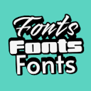
Font pairing 101: The ultimate guide to choosing the perfect fonts
Ever noticed how some designs just feel right, while others seem off, even if you can’t quite put yo...

Design
Classic art: How historical styles are shaping modern trends
Classic art isn’t just hanging in museums anymore—it’s everywhere. From viral memes to period dramas...