Product
Templates
Resources
Company
Home
Blog
Design
Design style visual reference guide: Design style names and descriptions
Design style visual reference guide: Design style names and descriptions

This is your in-depth guide to the most popular and common graphic design styles.
There’s a nearly endless amount of styles in art and design—so many that it can be difficult to place names and differentiate them. We know this from experience ourselves—when our content and production teams meet to discuss design trends, we can collectively recognize a look—but we can struggle to place a name to it. So we’ve taken this matter into our own hands.
In this article, we’ll name and explain some of most popular graphic design styles in alphabetical order, plus share visual examples and famous artists of the styles.
These are the graphic design styles that are nearly impossible to describe in a Google search to find their names. So with these standard design style names, you’ll have keywords to run more fruitful searches on platforms like Pinterest or Dribbble when you’re looking for design inspiration.
Spare yourself the headache of trying to describe a style to search engines and save this graphic design styles list to reference later.
Now, let’s dive in!
Graphic design styles: Table of contents
- A: Acanthus, anthropomorphic, Art Deco, Art Nouveau, aurora
- B: Baroque, Bauhaus, bento grid, Bohemian, Brutalism
- C: Conceptual sketch (doodle art), Cybercore
- E: Ethereal
- F: Farmhouse, filigree
- G: Gothic, grafitti
- J: Japandi
- K: Kawaii, kitsch
- L: Luxury Typography
- M: Memphis, mixed media, mystical western
- N: Neoclassical
- P: Pixel Art, Pointillism, Pop Art
- S: Shabby chic, Steampunk, Synthwave
- T: Tenebrism, three by three (3x3)
- V: Vaporwave, Victorian
- Y: Y2K
If you're an auditory learner, you can hear these graphic design styles explained in the video below!
Where do different graphic design styles come from?
Graphic design styles are at the core of how we visually communicate—each movement creates a unique message and mood that defines a design style. From sleek, modern design to timeless classics, styles are born through intentional stylistic choices of colors, composition, fonts, and visuals. But what influences these choices?
Three key pillars influence a graphic design style: historical movements, cultural influences, and technological advancements.
Cultural Influences: Regional trends, societal values, and traditions shape design aesthetics. Colors, symbols, and imagery adapt to cultural identities and local social issues, adding resonance to designs across different regions.
Technological Progress: Advances in technology, from the printing press to modern design software, push boundaries, enabling new design possibilities. AI is the latest breakthrough expanding the scope of graphic art.
Historical Movements: The legacy of artistic movements continues to influence design. Designers today pull inspiration from iconic movements like the shapes of Bauhaus or the opulence of Baroque, while also exploring contemporary trends such as minimalism, pixel art, and 3D design.
By understanding different graphic design styles, designers can build on established principles while also innovating to create unique and inspired work.
Graphic design styles list
Acanthus


Acanthus is a beautiful and intricate design style characterized by stylized leaves and floral patterns. The design is named after the Acanthus plant, whose leaves were commonly stylized and carved into stone in ancient Greek and Roman architecture. This decorative motif was especially prominent in the capitals of Corinthian and Composite columns. It experienced significant revivals during the Renaissance and Neoclassical periods, where it was incorporated into art, architecture, and design.
Today, Acanthus motifs add classical flair to various applications, from typography to interior accents. You'll often find it as a decorative element on wallpapers, stationery, cards, and even in modern print design.
Anthropomorphic


Ever seen an object or animal take on human-like traits in a logo, mascot, or illustration? That’s Anthropomorphic design! While it dates back to ancient myths and storytelling, where gods and spirits took on animal forms, this style found new life in the 20th century with the rise of cartoons, animation, and brand mascots.
Today, it’s a go-to style in playful ad campaigns, children’s books, quirky posters, and even vintage product packaging.
Art Deco
Art Deco is a sleek, geometric, and glamorous design style characterized by symmetrical patterns and metallic accents. Originating in the 1920s and 1930s, it embodies the optimism and luxury of the interwar period.
Today, Art Deco typography and visual elements are frequently used in upscale packaging, sophisticated event branding, and high-end interior accents that channel the opulence of the well-loved Great Gatsby era.
Art Nouveau
Art Nouveau embraces flowing lines, organic shapes, and floral motifs, often seamlessly integrated with elegant typography. Emerging in the late 19th century, this movement was heavily influenced by nature and sought to merge illustration with design. This movement lasted into the early 20th, partly as a response against industrial mass production.
You’ll still see a lot of fonts and typography influenced by this design style, and it’s still heavily used in poster designs, book covers, and even branding seeking a handcrafted, romantic touch.
Alphonse Mucha was one its most influential artists of the Art Nouveau era.
Aurora
Aurora is a gradient style the mimics the mesmerizing colors and glow of the Northern Lights (aurora borealis). Think smooth transitions of purples, pinks, blues, and greens into dreamy looking gradients. It emerged as a defining modern aesthetic in the late 2010s, with digital artists embracing bold, luminous color transitions.
You’ll see Aurora gradients everywhere lately, from sleek branding projects to UI/UX backgrounds and digital art that leans into cosmic or magical themes. For an extra edge, try adding a touch of grain or blur to these gradients. That simple tweak is a trend of its own, giving designs a fresh, ethereal glow.
In the video above, we dive into grainy gradients with a step-by-step tutorial on how to incorporate them into your designs using Kittl. Graham demonstrates how to create a trendy gradient poster, just like the one shown below, all with a free Kittl account.
Baroque
When it comes to Baroque style think dramatic details, swirling ornamentation, and intense contrasts that make everything feel lavish and theatrical. This style flourished in Europe from the early 17th century up to the mid-18th century, dominating architecture and art of the period.
But here’s an interesting backstory—Baroque wasn’t just about looking fancy. It was a power move by the Catholic Church during the Counter-Reformation (the Catholic response to the Protestant Reformation), designed to bring emotion and drama back into religious art.
The idea? To create awe-inspiring, reactions that would draw people back to Catholicism after the Protestant Reformation had stripped things down to the basics.
Bauhaus
Bauhaus strips design down to its functional essentials, focusing on bold geometric shapes, primary colors, and minimal ornamentation. Its primary ideals are form over function and clarity. Born from the German art school active between 1919 and 1933, Bauhaus set the stage for modernist design worldwide, influencing key design styles such Japandi design which we explored earlier.
Bauhaus is largely used in brand materials today for editorial and web design as well as product design. It utilizes heavy grid layouts for a sleek geometric look.
Bento Grid
The Bento Grid, inspired by compartmentalized Japanese bento boxes, is a clean, orderly layout style that organizes content into distinct sections with clear separation. It gained traction in the late 2010s, especially in UI/UX and web design, as minimalism and functional layouts became more popular.
You’ll frequently see Bento Grids used in dashboards, portfolio galleries, and Apple’s design language, where they create a minimalist yet high-end aesthetic. This layout is an excellent choice for branding and design that requires clean, uncluttered, and highly organized visuals.
Bohemian (boho)
Bohemian, or boho, design is a blend of global influences, layered textures, and earthy yet vibrant color palettes. This style radiates a laid-back, free-spirited energy, evoking a sense of wanderlust and artistic adventure. While its origins trace back to 19th-century artist communities, Boho design gained mainstream popularity during the hippie movement in the 1960s and 1970s, leaning heavily on bright and colorful palettes.
Today, this style is a go-to choice for event branding, fashion lines, and lifestyle products that embrace creativity and an eclectic aesthetic. Achieving a Boho look is relatively simple with the right typography and design elements—the most time-consuming aspect is often selecting the perfect color palette.
There's a ton of bohemian style design assets in Kittl—from fonts to illustrations to color palettes. Check out some of the assets from the bohemian logo design bundle in Kittl below:


Brutalism
Applied to graphic design, Brutalism is nearly the opposite of polished minimalism, favoring stark layouts, bold monochrome palettes, and unrefined typography. It’s intentionally raw, breaking away from conventional aesthetics to make a bold statement. Stemming directly from mid-20th-century architectural Brutalism, this art style had a digital resurgence in the 2010s.
Today, we’re spotting it used in edgy portfolio sites, streetwear, poster design, and brand identities that want to stand out. If you’re searching for styles similar to Brutalist Art, you can check "Maximalism" or Maximalist style art for another bold design direction.
Conceptual sketch (doodle art)


One of the most fun design styles in recent years is conceptual sketch art, also known as doodle art. This style is characterized by spontaneous lines, childlike or naive drawings, and freeform shapes. While sketching has always been a part of artistic expression, doodle-centric art gained significant popularity in the 2000s, particularly online. Today, it’s been picked up in more professional environments and used for designs that aim to convey a fun, unpolished energy, including branding for creative agencies, youth-oriented products, and editorial designs.
This design style offers creative freedom, allowing designers to easily transform hand-drawn sketches into digital assets. We do a deeper dive on this doodle art trend in another article and share exactly how to upload a simple doodle to Kittl, vectorize it, and instantly create a digital version of your image for your graphic design projects.
Learn more about doodle art with our in-depth guide that explores the trend plus how to create digital doodle art with physical, hand-drawn doodles—no tablet or drawing pad needed.
Cybercore


Cybercore is all about neon-lit visuals, circuit board motifs, and the feeling of living inside a high-tech world. Think metallic, finishes, harsh drop shadow, pop up windows, and a sense of digital speed. Rooted in 1980s cyberpunk culture, it gained traction in the 21st century with the internet boom. It was influential everywhere from fashion (think popular 90’s pop stars, Brittney Spears, NSync, and more). This style has recently been revived but via the keyword “IOS core.”
Lately, you’ll find it in gaming brands, festival posters, and marketing campaigns, vision boards, social posts, and more edgy branding. Watch the video below to learn more about this design style trend.
Ethereal

The Ethereal style focuses on soft hues, delicate layering, and a generally airy, otherworldly atmosphere with distorted, blurry imagery and photos—like you’re stepping into a dream. While airy aesthetics have shown up throughout art history, this particular style became extra trendy in the 2010s, especially in photography and web design.
We’re seeing Ethereal design in high-end fashion lookbooks, website hero images, and conceptual art pieces that aim for a soft, refined feel. It’s somewhat similar to Surreal design, but more grounded in reality. Instead of creating completely dreamlike or otherworldly scenes, Ethereal design takes realistic images and gives them a gentle, otherworldly glow—almost like viewing them through a dreamy, hallucinatory lens.
Ethereal style works excellent for design projects that need a nostalgic vibe.
Farmhouse or cottage-core
Farmhouse and cottage-core are closely related styles that emphasize rustic simplicity, natural fabrics, and countryside aesthetics. Rooted in rural settings, these styles became widely recognized through social media in the 2010s in interior design and fashion and continue to thrive today.
Today, farmhouse and cottage-core design often appear in home décor branding, boutique fashion labels, nature-inspired book covers, and any project seeking a warm, cozy feel that pulls us into the simple life.
Find more cottage-core design assets with the cottage-core YouTube design bundle below:
Filigree

Filigree is all about intricate, lacy patterns inspired by the delicate metalwork, marble, and wood designs seen in vintage jewelry and historical architecture. It’s rooted in centuries-old European craftsmanship, particularly from the 17th and 18th centuries. The name filigree name comes from the Latin words filum (thread) and granum (grain), referencing the tiny metal threads used in jewelry-making.
In graphic design, filigree often manifests as lavish swirls, flourishes, and fine details that instantly convey elegance and sophistication.
You’ll often spot filigree in premium packaging, wedding invitations, and anywhere a touch of ornate luxury is needed.
Gothic
Gothic is a classic design style that’s dramatic and well-loved. It balances themes of darkness and grandeur, shifting between eerie and ornate depending on how it’s applied. Originally emerging in 12th-century European architecture, the Gothic style has seen multiple revivals, influencing everything from typography to fashion.
These days, you may see Gothic-themed styling appearing in everything from band merch and logo designs to vintage branding and fashion. It’s an extremely interesting style in that it’s very versatile—you can create drastically different visuals that both follow gothic design principles.
Graffiti
The graffiti design style borrows trends from urban street art, showcasing bold spray-painted lettering, bright colors, and gritty textures. It’s energetic, rebellious, and full of personality. Modern graffiti, as we recognize it today, emerged in the 1960s and ‘70s alongside the rise of hip-hop culture.
Designers of today will lean into graffiti elements for edgy brand campaigns, music festival posters, and especially streetwear collections to capture that bold, underground aesthetic.
Japandi


Japandi is the beautiful and calming combination of Japanese minimalism and Scandinavian warmth. Think neutral, muted color palettes, organic materials and textures, and a touch of inspiration from traditional Bauhaus layouts (more on this later).
Japandi style gained popularity in the late 2010s into the 2020s, at the same time the wave of minimalistic interior design trends. You’ll find Japandi style influences in sleek websites, lifestyle product branding, and very often in calming and minimalist poster design.
We did a deep dive into this style as it’s currently growing at a rapid pace in popularity. In fact, it made it onto our 2025 graphic design trends list.
Kawaii
Kawaii is the Japanese concept of “cute” and features rounded shapes, pastel colors, and cartoon-like characters. While it emerged in Japanese pop culture in the ‘70s and ‘80s, it has since swept across global fashion, stationery, and media. You’ll see Kawaii style in product design, character branding, toy packaging, apparel brands, and social media graphics that are built on or inspired by the cute Japanese aesthetic.
Kawaii characters and images can be generated easily with Kittl AI. In fact, there’s a specific style option that you can select in the image generator to achieve the perfect kawaii AI image.
The video below shows how to create a KDP Color book with 25 kawaii mythological characters:
Kitsch

A Friend in Need (1903) by Cassius Marcellus Coolidge

Vogue Portugal Fevereiro 2024 - The Kitsch Issue Magazine Cover
Kitsch is a design style name that’s not incredibly well-known. It embraces bright colors, exaggerated imagery, and playful pop culture references, turning tackiness into an art form. This style is rooted in nostalgia and irony, often incorporating retro graphics and humorous elements. While the concept of kitsch dates back to the late 19th century, being largely used in interior design, it experienced a major revival in mid-20th-century pop art.
Today, kitsch design is commonly seen in novelty products, sticker designs, satirical branding, and marketing campaigns that lean into over-the-top humor. In interior design, kitsch embraces the principles of DIY and upcycling.
Kitsch is the German word for ‘trash’ highlighting the controversial aspect of this design style.
Luxury Typography

Another major design style that’s currently very trendy in graphic design is Luxury Typography. This approach focuses on refined, often custom typefaces paired with elegant scripts and intricate ligatures. High-end fashion branding in the 20th century played a significant role in popularizing this style, though its origins trace back to classic calligraphic traditions.
Luxury Typography remains a favorite in premium packaging, luxury streetwear branding, upscale event invitations, and high-end magazine covers. The growing interest in this style is evident. A quick search for "Luxury Typography" on Pinterest reveals a vast array of stunning examples that showcase its timeless appeal. We have a large collection of YouTube videos like the one below that explore luxury typography and how to incorporate it into your designs.
Memphis


Now for the classic and energetic Memphis style. With loud geometric shapes, bold colors, and playful patterns, it’s all about postmodern vibes. This style first stepped into fame in the early 1980s thanks to the Memphis Group, it quickly became iconic of that era’s experimental design scene. If you back to watch 80’s shows such as Saved by the Bell, Seinfeld, and Full House, you’ll see this pattern very frequently, whether in decor or on clothes.
You’ll see Memphis patterns today in retro branding, editorial pieces looking for a splash of fun, and funky product packaging. Kittl has a wide collection of design elements and templates (from social media posts to marketing materials) you can access with a free account.
Mixed Media

Source: www.pinterest.com

Source: www.pinterest.com
Mixed Media is exactly how it sounds, mixing different mediums or media forms in one cohesive image. From painting, photography, scrap materials, and more. The mixed media design style typically leans heavily into layering and unexpected juxtapositions, creating eclectic visuals. While artists have used mixed media for centuries, it saw a surge in use in the late 20th century.
Today, you’ll find mixed media in magazine spreads, album covers, and advertising campaigns.
Want to master this design style? Check out our deep-dive video!
Mystical Western


Mystical Western, is a term we’ve keyed ourselves to describe a specific design style we’ve been seeing frequently. Mystical Western is a fusion of classic cowboy aesthetics with celestial and spiritual imagery. This style features desert landscapes, moonlit nights, and cosmic symbols, blending rugged Americana with a dreamy, otherworldly feel.
Western art has historical roots dating back to the 19th century, but the mystical twist emerged in alternative and Boho design circles in the 2010s. It is a perfect fit for music festival posters, indie apparel, and branding that aims to capture a magical frontier aesthetic.
Neoclassical

"Napoleon Crossing the Alps" by Jacques-Louis David, 1801. Source: www.britannica.com

After the ornate Baroque and playful Rococo movements, Neoclassical stepped into the scene. If you’re a fan of the classic look of Greek and Roman portraits and architecture, this Neoclassical style is what you’ve been looking for.
This style came to be in the late 18th to early 19th century, mirroring the Enlightenment’s fascination with classical antiquity. Neoclassical art emphasized simplicity, symmetry, and restrained grandeur, reflecting a return to order and rationality after the excesses of previous styles (Baroque and Rococo). Nowadays, you’ll often see Neoclassical influences in formal print layouts, and even interior design settings that want a grand, timeless vibe.
A key way distinct Neoclassical art from other classic art forms is the use of red with earthy color palettes. Red is often strategically used in Neoclassical art to create contrast and highlight focal points, adding richness to the otherwise muted, classical color schemes.
Jump to our deep dive into neoclassical art and other forms of classic art in modern trends. Could the rising popularity of classic art be tied to the rising popularity of the hit Apple Series Severance?
Pixel art (8-bit, bitmap)
Now for something totally different—Pixel Art! If you grew up playing video games in the 70s or 80s, you’ll remember the blocky, low-resolution graphics that defined that era. Pixel Art, also known as 8-bit or bitmap art, is made up of tiny squares of color, often limited in palette, but full of nostalgic charm.
Popularized during the golden age of gaming, this style made a massive comeback with indie game developers in the 2010s. It’s everywhere now, from retro-inspired marketing (most often used in casual, eye-catching social media posts) to the design aesthetics of hit games like Minecraft.
Fun fact: Early game designers had to work with severe technical limitations, which led to the birth of Pixel Art. Today, those same limitations have become the style’s defining feature and appeal!
Explore pixel art ideas and learn how to create cute pixel art (in just minutes) in Kittl with our tutorial guide.
Pointillism

"A Sunday on La Grande Jatte" by Georges Seurat, 1884. Source: www.artic.edu
Pointillism is a design style that forms images entirely from tiny dots, relying on the eye to blend them into a cohesive whole. This technique, developed in the late 19th century, creates a distinct stippled effect that’s mesmerizing up close.
Due to its time-intensive nature, pointillism is now primarily used in book illustrations. But, its intricate and artistic quality makes it a unique and striking choice for branding and packaging. With its detailed dot work, pointillism brings a textured, hand-crafted quality that stands out visually.
French artists Georges-Pierre Seurat and Paul Signac are credited with developing the technique of Pointillism.
Pop Art

Marilyn Monroe portfolio silkscreen printing by Andy Warhol. Source: www.moma.org
Pop Art is a classic design style from the Pop Art movement that emerged in the United States and Britain in the mid-to late-1950s, led by artist Andy Warhol. It takes imagery from popular culture (pop culture) such as consumer products, comic strip images, and famous icons and represents them through bold colors and repetition to make a statement. The style emerged as a playful and eye-catching commentary on consumerism and celebrity culture.
Today, Pop Art remains as popular as ever for eye-catching visuals. It’s used frequently lately in everything from branding and packaging to apparel design and even web design.
Shabby Chic
For those drawn to distressed finishes, pastel tones, and vintage romance, Shabby Chic is the ideal design style. This aesthetic features faded florals, repurposed furniture, nostalgic elements, and soft textures.
It surged in popularity during the late 1980s and ’90s as a dominant interior design trend. In modern design, Shabby Chic remains widely used in wedding invitations, cozy product packaging, and branding for businesses aiming to convey a warm, sentimental touch.
Steampunk
Steampunk is an incredibly unique and fun style that fuses Victorian-era aesthetics with mechanical, steam-powered tech into visuals that appear both vintage and futuristic. Key elements used in steampunk design include gears, cogs, brass gadgets, and leather straps—all components in the steam-engine, coal powered, and steam filled streets of the Victorian era. Steampunk originated as a literary subgenre in the 1980s before growing into broader pop culture. You’ll often find the steampunk aesthetic in book covers, fantasy brand visuals, and merchandise that blends history with science fiction.
Design tip: The steampunk style can be generated easily with the Kittl AI image generator.
Synthwave
Another retro design style is Synthwave. Synthwave brings us back into the ‘80s with neon grids, palm trees, and dramatic sunset gradients. Its retro-futuristic themes are heavily influenced by electronic music and old-school 80s arcade aesthetics. In the late 2000’s there was a revival of ‘80s synth music that brought the style back to life and it became a widespread design trend in the 2010s.
Today, Synthwave frequently appears in album artwork, film, television, and digital media where neon-infused, high-contrast and energetic visuals are needed. It has also found a place in branding and marketing campaigns, leveraging its bold aesthetic for eye-catching materials.
To get started with the Synthwave style, use the design bundle below for easy access to all the Synthwave design elements you'll need.


Tenebrism


Tenebrism is a relatively unknown design style that hinges on extreme contrasts between light and dark, creating a high-drama, spotlight look. This technique stems from the painting style of the Baroque movement and was led by artists such as the Italian painter, Caravaggio (1571-1610). Tenebrism is intense and moody, drawing viewers’ attention to brightly lit areas surrounded by deep shadow.
Today, you’ll find Tenebrism-influenced designs in atmospheric posters and event flyers, editorial spreads, and even packaging that aims for strong visual tension.
Three by three (3x3) grid design


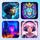
The 3x3 grid design is a term we've coined to describe a structured nine-box layout that organizes visuals into a clean, easily digestible format. While grid systems have long been a fundamental part of design, this particular layout gained popularity in the 2010s with the rise of social media aesthetics and mood boards.
Commonly seen in Instagram feeds, portfolio showcases, boutique branding, and apparel design, the 3x3 grid is valued for its visually striking yet orderly composition. It’s the perfect choice for creating a cohesive design that seamlessly incorporates multiple themes or concepts while giving each element equal prominence.
Vaporwave
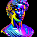
Vaporwave is an interesting internet-born aesthetic that mashes up old-school computer graphics, neon hues, glitchy effects, and most surprisingly of all: Greek busts. It emerged in the early 2010s from online communities and leans heavily on nostalgia and satirical design, incorporating elements from the ‘80s and ‘90s.
You may see it on album covers, digital collages, and experimental ad campaigns.
Victorian design
Victorian design is defined by ornate details, rich color schemes, and elaborate floral motifs. Stemming from the reign of Queen Victoria (1837-1901), this style influenced 19th-century art, architecture, and decor.
Modern applications of Victorian design include elegant calligraphy, themed event invitations, vintage branding, and even steampunk aesthetics, which draw inspiration from the intricacy of the era.
Y2K design
Y2K design perfectly captures the turn-of-the-millennium, vintage-futuristic vibes, blending cyber-inspired visuals with a playful, high-energy feel. It incorporates grungy textures, neon gradients, and futuristic, bubbly typography. Originally booming between 1999 and 2000, Y2K (Year 2000) design has made a huge nostalgic comeback since around 2020.
You’ll see it everywhere—from fashion editorials and digital collages to streetwear and brand campaigns—appealing to both younger generations discovering it for the first time and millennials reliving the nostalgia.
Fine the Y2K Shopify banner below and more Y2K designs in Kittl's template library!
Related articles

Tutorials
How to design Instagram Posts, Stories & Reels (+ free templates)
Research indicates that first impressions are formed rapidly, often in less than a second. If your f...

Design
Japandi style guide for graphic designers
The Japandi style has been rising rapidly in popularity, blending the simplicity of Japanese minimal...

Design
15 graphic design trends to keep an eye on in 2025
Graphic design trends are a highly debated topic in the graphic design space. At its core, trends ar...

