


Product
Templates
Resources
Company
Home
Blog
Design
Essential color theory guide for designers
Essential color theory guide for designers

This is your introductory guide to color theory. From color classification to how light impacts color perception, we’ll cover the foundation of this essential design topic.
Mastering these color theory concepts enables you to move beyond trial-and-error approaches to color. Here are three key takeaways you can expect from this color theory guide:
- Learn to use color thoughtfully and consistently, ensuring your designs stand out and resonate with audiences.
- Understand the core principles of color relationships, the HSV model, and color mixing methods to create cohesive, impactful designs for both digital and print media.
- Discover how color influences perception and mood, allowing you to design with intent and maximize your visual impact across various design contexts.
Table of contents
- What is color theory?
- A brief history of color theory
- Mixing colors: additive vs. subtractive
- The 3 categories of color: primary, secondary, and tertiary colors
- Understanding hue, saturation, and value (HSV)
- The influence of light on color perception
- Color psychology
- Color theory basics: Key takeaways
What is color theory?
Color theory is the set of principles on color that we use to universally understand how colors work together and impact our emotions, perceptions, and decisions. It encompasses various concepts, including the color wheel, color harmony, psychology, and mixing.
Color theory equips us with a deeper understanding of color in design to create harmony, contrast, and balance, enhancing design cohesiveness, and maximizing visual impacts.
At its core, color theory helps answer questions like: How do colors interact? How do they make people feel? What makes some color combinations appealing and others jarring? This color theory guide will provide answers to these questions.
It’s also important to note that color theory is a combination of artistic principles and scientific insights. On the artistic side, color theory helps us select colors that resonate emotionally, and achieve harmony, as mentioned above. On the scientific side, color theory informs fields like chemistry, digital imaging, and even astronomy.
These two foundational principles in color theory stem from the groundbreaking work of two prominent theorists: a scientist and an artist. Together, they laid the groundwork for our modern understanding of color, experimenting with how colors interact scientifically and how they resonate psychologically.
For auditory learners, we have a video introductory guide to color theory, hosted by Production Manager and Graphic Designer, Drew. In this video, Drew shares an overview of color theory, touching on the core principles of mixing color, primary color models, and how color impacts perception and mood. This video also explores the differences between RGB, RYB, and CMYK, as well as Hue, Saturation, and Value models. These are the essential design topics that will help you select colors more efficiently for your projects!
A brief history of color theory
Originally built from ideas in art and science, color theory has roots as far back as Aristotle’s work, later developed by numerous theorists. We’ll quickly dive into the two most revolutionary color theorists who laid the groundwork for color theory as we know it today; a scientist and an artist.
This info connects directly to our modern understanding of digital color, color psychology, and the use of warm and cool colors - essential concepts that we’ll explore below - so don’t jump ahead!
Let’s get into it:
In the 17th century, scientist Issac Newton established that white light is a combination of colors that can be separated by a prism, revealing the spectrum (ROYGBIV). This discovery led to Newton’s development of the color wheel and the idea that colors could be mixed from a set of primary colors - red, green, and blue.
This insight laid the groundwork for later theories, and, two centuries later, scientists Thomas Young and Hermann von Helmholtz solidified red, green, and blue as primary colors that combine to produce white light (these two will come up again later). This concept ultimately led to the RGB color model we use in screens today. Newton’s work was essential in laying this foundation for scientific color theory and our understanding of color on digital screens today.

Colour wheel from Newton’s Opticks (2nd ed., 1718)
Two centuries later, Johann Wolfgang von Goethe brought color theory beyond wavelengths of light and into the realm of human perception.
While Newton saw color as a straightforward scientific phenomenon, Goethe believed color was a shifting phenomenon that could change based on context, perspective, and even mood. He noted how some colors appeared “warm” (like reds and yellows) and others “cool” (like blues and greens), and why color affects mood - a perspective now key in fields like interior design, marketing, and color therapy.
He experimented with prisms like Newton, as well as with black-and-white patterns, shades of gray, and colored backgrounds, carefully observing how colors appeared differently depending on their surroundings.
Through this, Goethe discovered that color emerges at the boundaries, where light and shadow meet - leading him to develop his own color circle.

Goethe's color wheel
Mixing colors: Additive vs. subtractive
Newton's experiments with white light revealed that colors behave differently depending on the medium. Remember the two scientists, Thomas Young and Hermann von Helmholtz, we mentioned above? When these two showed that red, green, and blue combine to create white light they laid the groundwork for both the RGB color model and the concepts of additive and subtractive mixing.
Additive mixing is a process where primary colors are combined in varying intensities to create different colors. The more colors you add, the lighter the outcome. When all primary colors are combined at full intensity, they produce white light. Additive color mixing is unique to light-based systems, such as the RGB color model. The RGB method of additive color mixing is used for digital displays, including computer monitors and smartphones.
With subtractive mixing, pigments absorb (subtract) certain wavelengths of light, and only the remaining light is reflected back. The more colors you mix, the darker the resulting color becomes.
Subtractive mixing, is a process in which colors combine to produce create different colors at darker intensities. The CMY method, used in physical media, such as print, uses the primary colors cyan, magenta, and yellow.These pigments absorb specific wavelengths of light, and when all three are combined, they produce black. This method is used in physical media, such as print, as well as physical mediums such as painting.
While RGB and CMY are the two most common color models, you may be familiar with the traditional color model, RYB, used for mediums such as painting. RYB is another method that uses subtractive mixing of the primary colors red, yellow, and blue (RYB). When mixed together, the primary colors (red, yellow, and blue) produce a neutral, muddy color.

Why knowing the difference matters
Understanding additive and subtractive mixing allows you to anticipate how colors will appear on different mediums. For instance, a vibrant color on screen may appear muted in print. Being aware of these differences ensures that your designs will look as intended across various formats.
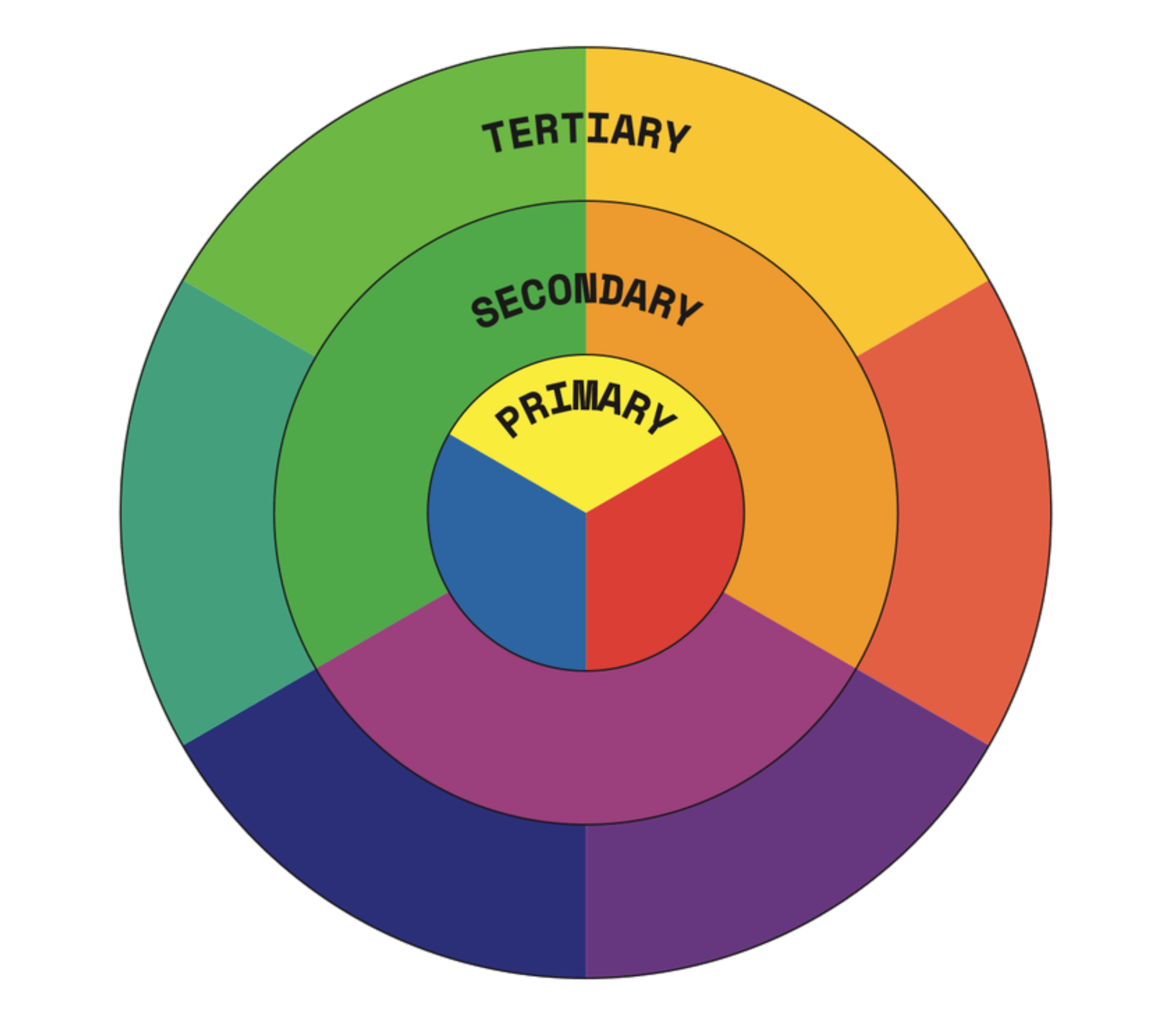
The 3 categories of color: Primary, secondary, and tertiary colors
At the foundation of color theory lies the concept of color mixing. All colors are derived from three primary colors that differs across the three color models. Primary colors then create secondary and tertiary colors. Let’s break down each category:
Primary colors
Primary colors are the root colors from which all other colors are derived. These colors cannot be created by mixing other colors, and their combinations form the basis for more complex hues, or base colors (more on hues below). While there’s several different color models, we’ll cover the two most common - RGB and CMY - as well as the traditional RYB model, often used in art and design.
Secondary colors
Secondary colors are created by mixing two primary colors together.
The importance of secondary colors: These colors add depth to the palette, providing a middle ground between the boldness of primary colors and the subtlety of tertiary colors.
Tertiary colors
A tertiary color is a primary color that’s combined with a neighboring secondary color on the color wheel. These colors help create more precise palettes, adding depth and complexity.
The importance of tertiary colors: These tertiary colors offer more complex hues and help designers and artists create precise and harmonious color schemes. They also form the basis for creating complex and natural-looking palettes by expanding the options available between the primary and secondary colors.
RYB (Red, Yellow, Blue)
Primary colors: Red, Yellow, Blue
Secondary colors: Purple (Red + Blue), Green (Blue + Yellow), Orange (Yellow + Red)
Tertiary colors:
Red-Orange (Red + Orange)
Yellow-Orange (Yellow + Orange)
Yellow-Green (Yellow + Green)
Blue-Green (Blue + Green)
Blue-Purple (Blue + Purple)
Red-Purple (Red + Purple)
RGB (Red, Green, Blue)
Primary colors: Red, Green, Blue
Secondary colors: Cyan (Green + Blue), Magenta (Red + Blue), Yellow (Red + Green)
Tertiary colors:
Amber (Yellow + Red)
Chartreuse (Yellow + Green)
Spring Green (Green + Cyan)
Azure (Cyan + Blue)
Violet (Blue + Magenta)
Rose (Magenta + Red)

CMYK (Cyan, Magenta, Yellow, Key/Black)
Primary colors: Cyan, Magenta, Yellow
Secondary colors: Red (Magenta + Yellow), Green (Yellow + Cyan), Blue (Cyan + Magenta)
Tertiary colors:
Orange
Chartreuse
Spring Green
Azure
Violet
Rose

Understanding hue, saturation, and value (HSV)
One of the most important models in color theory is HSV, which stands for Hue, Saturation, and Value. These three elements define how we perceive and describe colors, making them essential for any designer who wants to understand the nuances of color.
Hue
Hue is the base color itself - red, blue, green, etc. This is often the first aspect of color we notice, making it foundational in setting the overall tone of a design. A change in hue changes the color entirely, such as shifting from red to blue, which evokes very different emotions and reactions.

Saturation
Saturation refers to the intensity or purity of a color. Highly saturated colors appear bold and vivid, while less saturated colors are softer and more subdued. Adjusting saturation allows you to create either energetic, eye-catching elements or muted, calming backdrops, depending on your design needs.
To keep your imagery looking natural, avoid oversaturation - bright, overly vivid colors can make images appear unrealistic.

Value
Value describes the lightness or darkness of a color, impacting its overall brightness and contrast. A color with a high value will appear lighter, while one with a low value appears darker. Value adjustments can add contrast and dimension to your designs, helping certain elements stand out.
Adding white will tint your color, making it appear lighter or pastel. Adding black will shade your color, affecting the value and making it appear more dull or dark.
If you add gray to colors, you create a tone, which is a modification of the color's intensity.

Why HSV matters in design
Using the HSV model enables designers to use colors in a way that feels harmonious and visually appealing. A deep understanding of hue, saturation, and value allows you to fine-tune your color choices, whether you’re aiming for high impact with vibrant hues or subtle elegance with muted tones.
Experiment with HSV in Kittl for free - Easily adjust image settings to see how changing the HSV can transform the feel of your images and photos.
The influence of light on color perception
Light has a profound effect on how we perceive color, and this can vary significantly based on the environment in which a design is viewed. Bright natural light may make colors look more vivid, while dim artificial light can make the same colors look muted or dull.
Kittl Tip: When designing, especially for print, consider the lighting conditions where your design will be displayed. For example, designs intended for outdoor use should account for the brightness of sunlight, while indoor designs may need adjustments for fluorescent or LED lighting. For digital work, test how your design appears on multiple screens to account for differences in display settings.
Color psychology
Color speaks to viewers on an emotional level - the study of this is color psychology and it’s an integral aspect of color theory. When used thoughtfully and purposefully, colors can evoke a wide range of emotions - calm, excitement, trust, or energy.
Additionally, color temperature plays a significant role in the psychology of color and how we perceive images on an emotional and psychological level. Color temperature refers to the warmth or coolness of a color. It is often categorized into two main groups: warm and cold.
Cool colors:
Cool colors include blues, greens, and purples. Cool colors tend to create a calming, soothing, or relaxing effect. They are often associated with tranquility, nature, and peace. Cool colors are typically used to create more open, airy, or serene spaces. They’re often the go-to choice for spaces that need to promote focus or rest, like bedrooms or offices.

Warm colors:
Warm colors include reds, oranges, and yellows. They are associated with heat and energy. Warm colors tend to evoke feelings of excitement, comfort, and even passion. They’re ideal for spaces or designs that need to feel lively and engaging.

Kittl Tip: Consider how color temperature interacts with light to enhance the mood you’re aiming for in your design.
Color theory basics: Key takeaways
By mastering the basics of color theory, you gain the tools to make color choices that communicate and leave a lasting impression.
Here are some essential takeaways:
- Experiment with primary, secondary, and tertiary colors: build a versatile color palette that can shift with your design’s needs.
- Leverage HSV to balance colors: adjusting hue, saturation, and value helps create palettes that are appropriate for different contexts and moods.
- Understand additive and subtractive mixing: use the correct color model to ensure colors appear as expected on both digital and print mediums.
- Consider lighting and color temperature: remember that lighting conditions affect color perception, and design accordingly.