


Product
Templates
Resources
Company
Home
Blog
Inspiration
Exploring the 1950s Atomic Age design: A journey into mid-century futurism
Exploring the 1950s Atomic Age design: A journey into mid-century futurism

Did you know that in the 1950s, people decorated their living rooms with furniture inspired by nuclear particles and rocket ships—while also building backyard bomb shelters?
Welcome to the wild contrast of Atomic Age design—a visual style born from the tension between Cold War anxiety and space-age optimism.
Before we go any further, let’s clear something up. This topic is not to be confused with the “atomic design” in the context of UI systems and web development. We're diving into the mid-century movement that shaped how homes, ads, wallpapers, cars, and even shirts looked between the 1940s and 1960s.
For today’s graphic designers, there's plenty to rediscover in this retro-futuristic world: dynamic shapes, asymmetrical layouts, atomic motifs, and a color palette that still pops off the page (or screen).
So, let’s unpack where this movement came from, what made it tick, and how it still influences visual culture today.
Table of contents
- What is Atomic Age design?
- Why is Atomic Age design relevant to today's graphic designers?
- When did the Atomic Age design movement begin and end?
- Where did Atomic Age design have the most influence?
- Who were the key figures in Atomic Age design?
- What are the key elements of Atomic Age graphic design?
What is Atomic Age design?
Also referred to as atomic space age design, was a design style that's futuristic, geometric, and unapologetically hopeful—driven by society’s fascination with nuclear power and outer space.
Atomic Space Age Design emerged between the 1940s and 1960s, a period marked by significant scientific advancements and geopolitical tensions.
The detonation of the first nuclear bomb in 1945 ushered in the Atomic Era, profoundly impacting various facets of culture, including architecture, industrial design, and fine arts.
This era was characterized by a duality of emotions: the exhilaration of technological progress and the apprehension of nuclear warfare.
Designers mirrored this paradox by incorporating motifs of atomic structures and space exploration into their work, symbolizing both the promise and peril of the atomic age.
Famed designer Ray Eames, one-half of the iconic design duo Charles and Ray Eames, once said:
What works good is better than what looks good, because what works good lasts.
”Ray Eames
That principle echoed through much of the design from that era—where form met futuristic function in everything from boomerang coffee tables to starburst wall clocks and graphic posters loaded with scientific symbolism.
Influence on design disciplines
The fascination with atomic energy and space exploration permeated multiple design disciplines:
- Architecture: Structures like Seattle's Space Needle, constructed in 1962, epitomize Atomic Age architecture with their futuristic aesthetics and innovative use of materials.
- Industrial design: Consumer products featured sleek, aerodynamic forms and atomic motifs, reflecting the era's enthusiasm for scientific discovery.
- Graphic design: Advertisements and media embraced abstract patterns and vibrant colors, often depicting atoms, satellites, and celestial bodies to convey a sense of modernity and optimism.
Why is Atomic Age design relevant to today's graphic designers?
Today’s graphic designers are drawn to its playful, futuristic energy. Brands love it for the nostalgic yet forward-looking vibe, especially in merch like Atomic Age design shirts, posters, and packaging.
With bold shapes, retro colors, and orbit-inspired layouts, it’s a masterclass in storytelling through design. More than just a trend, it teaches valuable design principles—like modular layout, geometric typography, and strong visual rhythm.
This revival has led to a renewed interest in creating vintage-inspired apparel, such as designing a 1960s retro-style t-shirt, blending nostalgic elements with modern techniques.
It bridges the gap between print and digital and offers a unique, eye-catching aesthetic that’s still versatile in today’s market.
When did the Atomic Age design movement begin and end?
The Atomic Age design movement had its peak during the 1940s to 1960s. Let's take a look at how socio-political factors influenced the trend's rise and decline throughout the years.
1. The spark: Late 1930s–1945
The scientific world was buzzing with breakthroughs in atomic theory. In 1938, nuclear fission was discovered. This set off a global chain reaction—scientifically and culturally. But, the true ignition point came with the development of the Manhattan Project during WWII.
Key moments:
- 1938: Discovery of nuclear fission (Germany)
- 1942: Manhattan Project begins (U.S. secret nuclear weapons program)
- 1945: Bombings of Hiroshima and Nagasaki
At this point, the term "Atomic Age" was born, and while the immediate aftermath was filled with global fear, a new design language started forming—one that visually reflected the newfound atomic power.
2. The rise: 1945–early 1950s
The war was over, but the world had entered a new atomic reality. The U.S. entered a boom period—industrially, economically, and creatively. Simultaneously, the Cold War and Space Race had begun.
Cultural mood:
- Fear of nuclear war met with fascination for space, science, and futuristic tech
- Optimism about progress and modern living
- Suburban life was booming; consumerism was rising
Design impact:
- Atomic Age motifs exploded—atomic particles, orbits, starbursts, boomerangs, and sputniks
- Applied to furniture, wallpaper, signage, graphic design, cars, and product packaging
Fun fact: The starburst wall clock became a domestic icon, representing both the sun and atomic particles—common visual metaphors of power and energy.
3. The peak: Mid-1950s to early 1960s
This was the golden age of Atomic Age design. The U.S. was deep in the Cold War but also fully immersed in the Space Race against the Soviet Union.
Key moments:
- 1957: Sputnik 1 (the first artificial satellite) launched by the USSR
- 1958: NASA established
- 1962: Seattle’s Space Needle built for the World’s Fair
As a result, Googie architecture flourished—buildings with sweeping lines, neon signs, and “futuristic” shapes. Interior design embraced fiberglass furniture, pod chairs, and space-age lamps. And Graphic design went bold with asymmetry, geometric abstraction, and science-driven aesthetics.
4. The decline: Late 1960s to early 1970s
The mood began to shift. The novelty of the atomic age faded, and the realities of war and civil unrest took center stage.
Key moments:
- 1969: Apollo 11 moon landing (a high note, but also the beginning of the end for space-themed obsession)
- Vietnam War escalated
- Anti-nuclear protests gained traction
- Rise of environmental and anti-consumerist movements
Eventually, the futuristic optimism of atomic design gave way to earthier tones and back-to-nature aesthetics in the 1970s. Designers shifted toward brutalism, minimalism, and organic forms. Designs like Starbursts and Sputniks started to feel dated as culture turned inward.
Where did Atomic Age design have the most influence?
The U.S. was the birthplace and beating heart of the Atomic Age design movement.
Following World War II, America entered a post-war boom marked by consumerism, suburban expansion, and technological ambition.
Designers, advertisers, and architects embraced the imagery of atomic particles, satellites, and futuristic shapes to symbolize a modern, forward-looking lifestyle.
Where it showed up the most:
- Interior design: Kitchens, living rooms, and even kids' bedrooms adopted bright pastels, boomerang tables, and vinyl chairs with chrome legs.
- Graphic design: Product packaging, travel brochures, record covers, and TV logos were flooded with atomic or space motifs.
- Architecture: Googie-style diners, drive-ins, and motels lined American highways, characterized by swooping roofs, exaggerated angles, and neon signage.
- Consumer products: Everything from wallpaper to barware had starbursts, molecule patterns, or rocket-themed shapes.
Fun fact: The Las Vegas Strip was one of the most iconic showcases of Atomic Age design—with its bright, bombastic neon signage inspired by Googie architecture and mid-century visual trends.
Pop culture, media, and entertainment: A global broadcast

Hollywood played a major role in globalizing Atomic Age imagery. Science fiction films, cartoons, and television shows like The Jetsons, Forbidden Planet, and Lost in Space projected this futuristic style into homes around the world.
Designers in animation, film sets, and costume design brought the atomic aesthetic to life with:
- Spacesuits, ray guns, and dome helmets
- Control panels with glowing buttons and radar screens
- Abstract, angular furniture that looked like it belonged on a spaceship
Everyday public spaces

You didn’t need to go to the movies to see Atomic Age design. Across American and Canadian suburbs—and even parts of Australia—you’d find:
- Bowling alleys, banks, gas stations, and grocery stores designed with Googie flair
- Drive-in theaters with massive signage and stylized mid-century fonts
- Airports and civic buildings adopting futuristic curves and open-plan interiors
These weren’t elite or gallery-level designs—they were everyday spaces meant to make the future feel accessible to all.
Who were the key figures in Atomic Age design?
Designers like Alvin Lustig and Lucienne Day are the top designers in designs.
Before we go into the design legends, here’s something important to remember: Atomic Age design is less about strict rules and more about a vibe—futuristic, playful, filled with repetitive motives, and geometry-driven.
If you’re looking to create your own Atomic Age design shirts, wallpapers, or graphics, exploring the work of these pioneers is the best way to understand the style in action.
Alvin Lustig
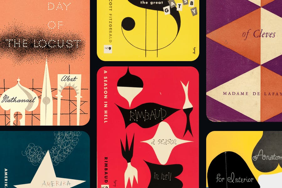
A leading figure in modernist book cover design during the mid-century, Lustig used abstract geometric forms, asymmetry, and bold colors—hallmarks of atomic age graphic design. His work pushed beyond literal interpretations and into symbolic, futuristic forms.
Where to look: His book covers for New Directions Publishing are textbook examples of atomic age visual experimentation.
Lucienne Day
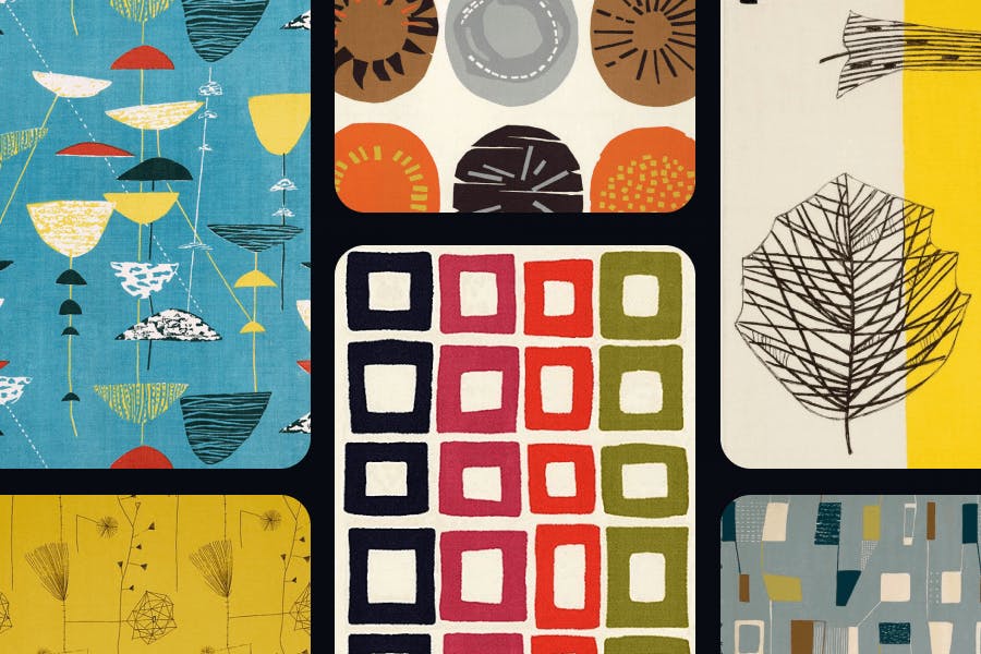
Though based in Britain, textile designer Lucienne Day is known for her science-inspired motifs—think cellular structures, atomic particles, and abstract plant forms. Her 1951 design “Calyx” is considered a masterpiece of atomic age interior design.
Where to look: Her textile patterns are often cited in atomic age wallpaper inspiration. Perfect reference if you’re designing backgrounds or home-themed graphics.
What are the key elements of Atomic Age graphic design?

The key elements of Atomic Age graphic design include orbit-inspired layouts, abstract scientific forms, asymmetrical compositions, retro color palettes, motion-driven lines, stylized typography, and modular repeating patterns.
To effectively incorporate Atomic Age aesthetics, it's essential to delve into mastering vintage design techniques that capture the era's distinctive look and feel.
Step into a world where science meets style and bold shapes collide with futuristic optimism. While some motifs like starbursts and boomerangs are well-known, there are deeper design traits that truly define this mid-century movement.
Let's break them down so you can confidently create everything from Atomic Age design shirts to digital illustrations that channel this iconic look.
1. Orbit-inspired layouts
Atomic age graphic design often mimicked the structure of the atom itself—circular, orbit-like paths that radiate from a central point. You’ll see this used in compositions where objects revolve around a focal point, similar to electrons circling a nucleus.
Design tip: Use this technique to create logos, shirt graphics, or poster layouts that feel dynamic and “in motion.”
2. Abstract scientific forms
Forget literal representations—designers during the atomic era embraced abstraction. They drew visual inspiration from:
- Molecular diagrams
- Radiation waves
- Cosmic rays and radar pulses
These elements gave their work a techy yet artistic feel, making it instantly recognizable.
3. Asymmetry over balance
Unlike the rigid grids of earlier design styles, atomic age aesthetics thrived on unexpected visual rhythms. Asymmetrical layouts gave designs a modern, space-age energy.
4. Playful, limited color palettes
To capture the vibrant and futuristic essence of Atomic Age design, here are three curated punchy color palettes that you could try, complete with their hexadecimal codes:
1. “Vintage Atomic Age” palette: This palette reflects the mid-century modern aesthetic with earthy tones complemented by muted greens and blues.

- Redwood: #9C5851
- Deer: #C47A5A
- Light French Beige: #D0AC7F
- Wintergreen Dream: #588B7E
- Artichoke: #96A385
- Dark Electric Blue: #5F7080
2. “Atomic Era” palette: Featuring a harmonious blend of warm and cool tones, this palette embodies the optimism and innovation of the atomic era.

- Terra Cotta: #D97364
- Dutch White: #F1E4B7
- Pewter Blue: #83B3AB
- Yankees Blue: #21233A
3. “Galactic Serenity” palette: This palette draws inspiration from the tranquil hues of distant galaxies, blending cool tones with subtle warmth to evoke a sense of calm and wonder.

- Deep Space Blue: #1A0D4B
- Nebula Violet: #4C2C92
- Cosmic Lavender: #7A4EAB
- Starlight Peach: #E2C4FF
- Celestial Ivory: #FFFAF0
4. “Retro Futurism” palette: Combining vibrant and muted tones, this palette reflects the nostalgic yet forward-thinking essence of mid-century Space Age aesthetics.

- Satellite Silver: #C2C2C2
- Orbit Orange: #FF5E57
- Astro Aqua: #4A90E2
- Meteorite Gray: #1B1F3B
5. Line work and linear motion
Designs often used lines to suggest direction or movement—representing speed, atomic energy, or futuristic transportation.
Look at vintage automotive ads or sci-fi posters, and you’ll see angular lines cutting through the layout, hinting at motion and momentum.
6. Stylized typography

In Atomic Age graphic design, designers often employed typefaces that embodied the sleek, modern aesthetic of the mid-20th century.
Imagine something bold, experimental, and often futuristic –and you’ll spot typographies like:
- Atomic Age: Inspired by 1950s-era connected scripts seen on American car nameplates, this typeface offers a highly legible, somewhat mechanical appearance. It is versatile, suitable for both small and large display sizes.
- Microgramma: Designed by Aldo Novarese and Alessandro Butti in 1952, Microgramma is a sans-serif typeface characterized by its geometric shapes and clean lines. It became popular in technical illustrations and was favored by graphic designers in the 1960s and 1970s.
- Bank Gothic: Created by Morris Fuller Benton in 1930, Bank Gothic is a rectilinear geometric sans-serif typeface. Its design has been associated with science fiction, military, and corporate aesthetics, making it a suitable choice for Atomic Age-themed designs.
- American Captain: A bold, compressed sans-serif that channels classic mid-century Americana. Perfect for Atomic Age design shirts, posters, and branding. It’s inspired by lettering from U.S. Navy recruitment posters and vintage military insignia, making it feel strong and distinctly retro.
- Atomicaboy: A geometric script font that reinterprets lettering from the Atomic Age, inspired by power tool lettering and chromed emblems of the 1950s. It features automatic ligatures for seamless letter connections.
When selecting typefaces for Atomic Age designs, look for fonts that exhibit geometric shapes, clean lines, and a futuristic feel. Or, you can reference a curated list of the best free retro fonts for vintage designs to get an authentic appearance.
7. Modular and repetitive patterns
Inspired by textile and wallpaper design, many atomic visuals relied on repeatable units—symbols, shapes, or icons used in sequence or rotation.
Use this technique for Atomic Age design wallpapers or apparel patterns. Repeating atomic icons in a grid can turn into a versatile graphic asset.
The Atomic Age Design movement: A timeless source of inspiration
From orbit-inspired layouts to bold typography and starburst motifs, the Atomic Age design movement wasn’t just a product of its time—it was a reflection of human imagination at its peak.
Born from an era of scientific discovery and space-age optimism, it gave us a visual language that still resonates today.
For modern graphic designers, this retro-futuristic style offers more than nostalgia. It’s a toolbox of bold choices, playful experimentation, and purposeful design. Whether you're creating merchandise, posters, or digital assets, Atomic Age design brings energy and originality to any project.
Curious to try it out for yourself? With tools like Kittl, you can start experimenting with atomic-inspired type, bold color palettes, and retro shapes—no need to start from scratch. See Kittl’s pricing and features to explore which plan works best for your creative goals. It’s the perfect place to bring a little mid-century magic into your next design.
Related articles

Inspiration
Last of Us Season 2 design guide: Capturing the post-apocalyptic aesthetic
The Last of Us Season 2 is coming. And if you’re anything like me, the trailer didn’t just leave you...

Tutorials
The 7 elements of art: A guide for aspiring artists
Did you know that Leonardo da Vinci was such a meticulous artist that he spent about four years pain...

Inspiration
Font pairing 101: The ultimate guide to choosing the perfect fonts
Ever noticed how some designs just feel right, while others seem off, even if you can’t quite put yo...