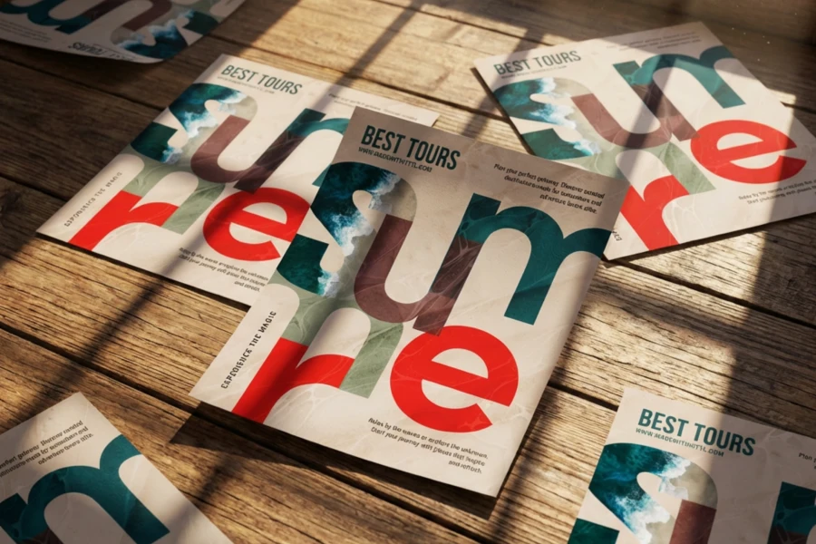
Ever noticed how some designs just feel right, while others seem off, even if you cant quite put your finger on why?
A lot of that comes down to typography. Fonts do more than display words — they set the mood, create hierarchy, and shape how people perceive your message.
In fact, consistent typography can increase brand recognition by up to 80% according to Linearity. Thats huge! The fonts you choose arent just decorativetheyre a powerful tool that helps build trust, professionalism, and identity.
Think about it: a wedding invitation in Comic Sans wouldn’t exactly scream elegance. And a bold, heavy metal album cover using a delicate script or fun fonts? Probably not the best fit.
At Kittl, we take fonts seriously. Typography has always been part of our DNA. That love for well-crafted fonts is what drives us to make the Kittl App that helps designers create beautiful typography with ease.
So if you’ve ever struggled with choosing the right fonts or doing your own calligraphy, don’t worry — you’re not alone. This guide will break down the basics of font pairing, show you what works (and what doesn’t), and give you practical tips to make your designs look polished every time.
Let’s jump in!
What is font pairing?
Font pairing is just matching fonts that look good together. It’s all about finding the right balance. Whether that’s mixing bold with simple, modern with classic, or even two totally different styles that just work. A good combo makes your design easy to read, eye-catching, and full of personality.
5 unlikely font pairings that shouldn’t work — but do
Think clashing styles can’t mix? These unexpected font combos aesthetic prove that contrast can be bold, stylish, and surprisingly effective.
01. Cal Sans Semibold, Manrope Regular, and PT Sans Regular
Cal Sans Semibold + Manrope Regular + PT Sans Regular is a killer combo for formal posters that need to be bold but easy to read.
Cal Sans Semibold’s sharp, structured letterforms make sure the headline grabs attention, while Manrope Regular keeps the body text smooth and effortless to scan. Then there’s PT Sans Regular, with its 40px line height, making sure everything has breathing room — because nobody can read a crammed-up text.
Set this trio against a white background, and you’ve got a clean, high-contrast layout where every letter stays crisp and clear. Thanks to strong ascenders, clear counters, and well-balanced spacing, this pairing works at any size, ensuring your message actually gets read — not just glanced over.
02. Kame Poster Black & Century Gothic Bold
If youre going for that glow-fest, psychedelic-but-edgy vibe, pairing Kame Poster Black with Century Gothic Bold is a solid move.
Kame Poster’s chunky, almost wavy letterforms bring a sense of movement and fluidity, making it feel more dynamic than your typical blocky display font. It holds up against neon outer glows, color dodge overlays, and blurred gradients, keeping the headline bold and attention-grabbing. Meanwhile, Century Gothic’s smooth, circular shapes ground the design, ensuring the details stay crisp and legible.
Set it against a deep gradient background — electric blues, purples, or cyberpunk magentas — and the whole thing comes alive. This pairing isn’t just about standing out; it’s got energy, contrast, and just the right amount of free-flowing rhythm, making it perfect for festival posters or any design that needs to feel bold, electric, and full of movement.
03. Ynsect Moksha Regular & Public Sans Regular
Ever seen a poster that just hits differently — like it’s calling for action right then and there?
That’s the kind of energy you get when you pair Ynsect Moksha Regular with Public Sans Regular. Ynsect Mokshas jagged, distressed letterforms bring a raw, rebellious feel perfect for making a statement about resistance, urgency, or systemic issues.
Meanwhile, Public Sans Regular keeps things cold and bureaucratic, almost like it belongs in a legal document or a government report.
That contrast — gritty protest lettering against the clean, institutional text — creates just the right amount of tension, making the message hit harder. Want to push the vibe even further? Go for high-contrast black and white with bold red accents, mimicking stencil markings, case files, or warning labels.
04. BIT Nostalgic Regular & Jet Brains Mono Regular
Pairing BIT Nostalgic Regular with JetBrains Mono Regular is like stepping into a futuristic office straight out of a retro computer game.
BIT Nostalgic’s pixelated, digital-era look feels like old-school tech, giving off a corporate-meets-arcade vibe, while JetBrains Mono’s clean, coding-friendly structure keeps everything sharp and precise. It’s a mix of nostalgia and modern tech, making it a solid choice for fintech brands, AI startups, or sleek digital workspaces.
Surprisingly, this combo could even work in unexpected areas like healthy food advertising with the right color palette and image. To really dial up the IT-tech aesthetic, try pairing it with deep blues, neon greens, or grayscale metallics to push that high-tech, grid-based look. Whether you’re going for cutting-edge or playfully retro, this font pairing gets the job done.
05. Amatic SC Bold & Poppins Medium
Amatic SC Bold & Poppins Medium makes an unexpectedly fun and versatile pair, blending hand-drawn charm with modern structure.
The tall, slightly playful letterforms of the Amatic SC add a sense of personality — like something you’d see on a cozy café menu or a creative event flyer. Poppins Medium, with its clean, geometric build, keeps everything looking polished and easy to read, preventing the design from leaning too casual.
The duotone in the posterdark purple and white, also makes it simple, bold, and easy on the eyes. The high contrast keeps everything legible, while the limited palette ensures the design stays clean and focused, making this pairing perfect for anything that needs to feel inviting, approachable, and effortlessly stylish.
Bonus: Helvetica Now & Avenir Next
Looking for something modern and sleek? Helvetica Now‘s clean, structured letterforms give titles a bold, no-nonsense presence, while Avenir Next’s geometric yet subtly humanist design keeps the body text smooth, approachable, and easy to read.
This duo works because it blends timeless Swiss-style typography with contemporary warmth, making it a go-to choice for tech brands, finance, architecture, and high-end corporate identities.
It’s neutral enough to fit any industry but polished enough to never feel boring. Try it with a monochrome palette or muted pastels for that ultra-minimalist, high-end feel, or add subtle gradients and glassmorphism effects to push the futuristic aesthetic even further.
New to typography? When & where font pairing matters
When should you care about font combos aesthetic? Always. Whether youre designing a logo, a website, or even just a simple Instagram post, your font choices shape how your audience feels about your work.
A great font pairing makes a design feel intentional and polished, while a bad one… well, let’s just say it’s like wearing socks with sandals — not a good look.
Where does font pairing come into play? Pretty much everywhere. Youll find it in branding, packaging, websites, advertisements, social media graphics, and even UI/UX design.
Fonts influence everything from how trustworthy a company feels to how easy it is to navigate an app. Ever wonder why some brands feel sleek and modern while others feel warm and nostalgic? Yes—typography plays a huge role in that.
Font pairing trends to watch

Like fashion, fonts go through trends. Here’s what’s hot right now:
- Serif + Sans-Serif combinations: A timeless go-to for balancing tradition with modernity (think Playfair Display with Montserrat).
- Variable fonts: A single font that adapts in weight, width, or slant, offering flexibility for responsive designs. Try pairing Butler for your header with Avenir Next as your body to create an art pharmacy aesthetic: clean, structured, and a little experimental.
- Retro-inspired typography: Nostalgic fonts from the 70s, 80s, and 90s are making a huge comeback in branding and social media.
- Minimalist & clean fonts: Simple, readable typefaces continue to dominate web and app design for a sleek, user-friendly experience. For a refined, high-end feel, try Adobe Garamond or Cormorant Garamond for headers, paired with Neue Haas Grotesk for body text. This combo blends classic elegance with modern precision, making it perfect for luxury branding, editorial-style websites, or sophisticated UI designs.
- Accessibility-friendly typography: High-contrast fonts with good legibility are becoming essential for inclusive design.
With so many applications and trends, mastering font pairing isn’t just a skill—it’s an asset that will level up any design you create. Now, let’s break down the key principles of pairing fonts like a pro.
What makes a good font pairing? Key principles to follow
To create font combinations that work, you need to understand typography’s essential building blocks:
- Contrast vs. harmony: A good font pairing balances contrast (differences in x-height, stroke thickness, or serifs) and harmony (similar letter spacing, ascenders, or terminal styles) to create a visually appealing composition.
- Typeface categories: Serif fonts (with defined strokes and terminals) feel classic and elegant, while sans-serifs (clean, geometric letterforms) are modern and minimal. Display and script fonts add personality but should be used sparingly for contrast.
- Font weight & spacing: Bold and regular weights establish hierarchy, while cap-height and x-height proportions impact readability. Proper kerning (letter spacing) ensures a polished look.
- Branding & mood: Fonts influence perception. A sharp stem and ascender give a strong, structured feel, while a soft bowl or ear can add friendliness. Always match typography to the tone of your brand or message.
- Legibility & readability: Decorative or script fonts often have complex descenders and terminals, making them harder to read at small sizes. For body text, opt for fonts with clear counters and open letterforms to maintain clarity.
How to master font pairing: A step-by-step guide

Font pairing isn’t just about picking two typefaces that look nice together — it’s about creating a visual hierarchy that enhances readability while supporting the overall aesthetic of your design. In a conversation with our YouTube Whiz, our co-founder Tobias Saul shared a simple yet crucial typography tip:
That philosophy applies to font combinations, too. The more complex a design, the more important it is to keep your typography clean and intentional.
1. Start with a primary font
Say your client wants a ‘vintage feel’ when they look at their poster. Before you start pairing, look at your references. Check out those font pairing websites. Whether its a vintage label, a modern UI, or a classic book cover, great designs often follow typography rules that already work.
Chances are, you’ll create your own pairings, but it helps to see which compositions and styles work best to get a feel for things.
Your primary font should set the tone for your design. If youre working on branding (or a specific medium like an infographic vs poster), ask yourself:
- Should the font feel traditional and authoritative (serif)?
- Modern and clean (sans-serif)?
- Expressive and unique (display or script)?
Headstock glyphs (introduced in Kittl’s 2022 release) let you explore different variations within the same font, making it easier to fine-tune your selection without switching typefaces.
2. Find a complementary font
Once you’ve locked in your main font, it’s time to find its perfect partner. You can either:
- Contrast fonts (e.g., a bold serif with a delicate sans-serif for balance).
- Use similar characteristics (e.g., two sans-serifs with varying weights for consistency).
If you’re working in Kittl, you can adjust your font’s variables to get to your ideal width and weight. Feel free to play around with the sliders, so you can fine-tune the contrast within a single-type family, giving you quality results in less time.
3. Limit to two or three fonts

Too many fonts create clutter and confusion. Stick to one primary font, a secondary for contrast, and an optional accent font if needed (for things like callouts or decorative elements).
This keeps your design readable and prevents it from looking messy. Think of it like layering clothes — too many patterns and textures, and the whole outfit feels overwhelming.
4. Use online font pairing charts and tools
If you’re stuck, don’t overthink it — use font pairing tools to jumpstart your creativity:
- Google font pairing generator or any free font pairing generator (widely available options)
- Kittl (built-in assets, fonts, and customization tools)
- Adobe Fonts (premium, professional typefaces)
Working in Kittl? Good news! You never have to leave the app to grab elements from Creative Market or other external sources.
With Kittl’s assets, elements, and illustration tools, you have everything you need right inside the platform — including a border feature that lets you neatly cut off illustrations from the rest of your typography without having it feel left out.
5. Test and adjust your font pairing
Font combination isn’t just about choosing fonts — it’s about how they work in a real-world layout. Before finalizing your design, check how the fonts behave in different applications:
- Website headers & body text Is the hierarchy clear?
- Logos & branding Do the fonts scale well?
- Posters & packaging Is everything readable at a glance?
If you want to add more depth to your typography, try text effects like hatched shading. No need to manually create multiple offset paths.
Why typography and font pairing matters to us at Kittl
At Kittl, we’re obsessed with typography — not just as a design element, but as a craft.
Our co-founder, Tobias Saul, started his career as a lettering artist, creating type by hand before transitioning into digital design. That foundation in traditional typography shaped how we approach fonts today: with precision, creativity, and an appreciation for detail.
That’s why we built Kittl — to give designers the tools to experiment with type in ways that feel effortless, yet powerful. Whether you’re creating logos, posters, or branding materials, the right font pairing can make all the difference.
Now that you’ve got a solid grasp of how to combine fonts effectively, it’s time to put your knowledge to work. Play around with different typefaces, test out new font combinations, and most importantly — have fun with it!
Need an easy way to experiment with font pairings? Try it out in Kittl and bring your typography ideas to life.

Dev Anglingdarma is a Content Writer at Kittl, specializing in UX writing and emerging tech that empowers designers to work faster and smarter. With five years of experience in economic research and IT solutions, she transforms complex topics into clear, actionable insights for creative workflows. At Kittl, Dev explores AI features and tools that make design intuitive from the start.


